Friday, January 6, 2006
CSS Pitfalls
I’ve completely switched to CSS in 1998 (when there was still the need to optimize for The-Browser-You-Shall-Not-Speak-Of), been using it ever since, and really like it. But it’s not without pitfalls and problems, either. Here are some of them... a “worst of” collection, if you want.
Class Chaos
You can easily generate too many (semantically correct) classes. In fact if you juggle around with too many CSS classes, you won’t easily remember which ones to use for which purpose, which results in even more new classes being created on the spot whenever the need arises. Also, a multitude of specific classes can make a redesign a pain, because you don’t want to go back to every HTML page (there might be 1,000s) to make sure your new stylesheet is rendering as intended.
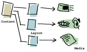
It’s my experience you should only be using a bare-bone set of classes. However, sometimes clients (or the designer of your web agency) will demand a lot of different layouts for different pages, even if the elements on those pages (in theory) are semantically related. Clearly, CSS was not invented to solve the problem of creating one specific design for every single page, at least not when you adhere to the “strict” rule by separating content from layout, using no inline styles and only external stylesheets. In the case of having to cover a multitude of layouts, the best approach is to split up the CSS file into page-dependent files, and to create comment-separated sections within single stylesheets.
Just What Are the Semantics of This...?
You know, CSS gurus snicker at newbies who create a class by the name of “bigRed” or similar. Why? Because this class actually doesn’t separate content from layout; in a redesign, if ever you’d decide big and red is not what you’re aiming for, you’d have to either “cheat” by keeping the class name but changing the color, or you will have to go and change all the HTML which contains the class name “bigRed” to now read “bigYellow.” (The other downside is you can’t easily write different media-dependent stylesheets on top of such class names.)
So, that’s the theory. However, in reality, it’s often awfully hard to come up with semantically correct names. Of course, class names like “footnote” or “authorName” and so on are obvious, and good. But what if the look you’re going for on an individual page could best be described as “whispering feminine voice which reminds one of candy"? Maybe the stylesheet for this, if done inline, would be a simple “letter-space: 2px; color: pink; font-size: 90%”. What is the use of a class here if you’re almost certain you won’t re-use this style in the next decade or so? Clearly, it would only bloat your CSS file, which is included in all of your pages for a specific site. Also, it would force you to crack your head on the problem of finding a fitting semantic class name, when you actually already have a clear visual result in mind.
In cases like these, inline CSS may be the way to go, if you keep in mind that by inlining styles, you’re also losing the media-dependency rules of your external CSS (meaning the inline style will be rendered equal on print, text-to-speech, and so on, and potentially, cause problems when combined with user stylesheets).
You Need a Template Anyway
Not to make this sound like an argument against CSS (it’s not!) but you need to remember you need a templating system anyway. Whether it’s something simple, like a function to include the header, and one to include the footer, or something more luxurious (XLST)... you need a way to change content on all pages quickly.
Naturally, CSS fits nicely on top of such a templating system, so it’s not an either-or question. But if ever someone tells you that CSS is their only templating mechanism, you have reason to be suspicious.
Cross-Media Utopia

When linking to external CSS files, you have the chance to tell the browser which media you support. For example, you might say “this stylesheet supports print, screen, and projection, but for handhelds, take this alternate stylesheet.”
Ah, if only all “user agents” (aka browsers) would adapt to the W3C! This would be developer heaven. But today, what’s the purpose of using media “handheld,” when silly browsers like mobile IE’s still take the screen stylesheet even when they are running on a handheld?
As often with W3C standardization (recommendation) issues, there’s a bit of a chicken and egg problem here. Some browser vendors will only support a W3C standard if enough web developers make use of it. Vice versa, some web developers will only make use of a W3C standard if the major browsers support it. So who’s to start?
Frames are Evil, Tables are Evil...
I agree. Frames are evil. And table-based layout is a mess indeed. I’m happy I’m not doing mid-90s HTML anymore, ’cause it looked ugly.
Then again, some things are very easy to do using tables/ frames/ deprecated doctypes (the latter will push the browser into a more forgiving, and sometimes more powerful quirks mode). Centering vertically is such a thing. While there’s an abundance of CSS hacks to achieve practically everything, these are also just that: hacks. And what’s the difference between a deprecated, table-layout hack, and a CSS hack? OK, so maybe the CSS hack is the more modern way of doing things wrong. Neither approach is the epitome of elegance. And as is often the case with hacks, they’ll bite you from behind in later stages of the project (in particular when a new browser version comes along, or someone’s viewing the site in an exotic browser, which always results in frantic phone calls, misworded emails, and a lot of unnecessary confusion).
Don’t Reuse for the Sake of Reuse
Reuse is a great thing, but don’t overdo it when it comes to CSS. Specifically, I would suggest you never use the same base CSS file for two different sites (which then carry their own added CSS file), no matter how much they have in common. Because who knows how much they might have in common in the future?
Designs Can be Changed So Easily, I’ll do Mine Later
When you use a CSS/(X)HTML Strict approach, redesigning the site after all HTML is finished is relatively easy (if you used semantically correct class names, that is... and for now I’ll leave aside the problem of not knowing in advance which elements to give a class, because you don’t know which ones you might want to style later on!). However, if you don’t work on a predefined layout, this can also lure you into an “I’ll do it later” mode. When you’re in that mode, you’ll simply name your elements in good ways – like “paragraph with the class author” – but you don’t actually have a fitting CSS for them yet. In the end, the site may be easily redesigned, but it doesn’t have a proper first design to begin with! This problem is related to the next one...
With CSS, You Can Design on the Fly... But Should You?
CSS makes designing a site so easy, you can actually do the layout “on the fly” while writing the HTML template/ the CSS. My suggestion tho: don’t. By all means, try to design the page in a graphic program first, and while you’re at it, forget about what’s hard and what’s easy to do in CSS. Only later on when the overall design is finished does it make sense to play around with smaller design issues right in the CSS.
>> More posts
Advertisement
This site unofficially covers Google™ and more with some rights reserved. Join our forum!
