Wednesday, October 20, 2004
Internet Cafe
My tech-savvy grandfather Gerhard Lenssen is educating older people in the use of computers and the internet. I asked him to write about his experiences.
Every month up to a dozen people, male and female, meet at the Senior Citizens-Academy internet cafe. It’s located near the 700-year-old medieval town of Bernkastel, Germany, at the Mosel river. Why do they meet? Here are some of the replies to that:
“I finally want to understand what my grandson’s doing at the computer.”
“Isn’t that the place to look up train connections?”
“My son’s living in the USA and wants to keep in touch with me via the internet.”
“How do I pay bills online?”
Sometimes, people attending the course are simply curious. And brave.
I always start with a question: “So who of you doesn’t have the slightest clue at all?” And there will be some people raising their hands. “Please take a seat then right here in front of the screen and keyboard” (I’m careful not to scare older people by using the English words “screen” and “keyboard”. Instead, I’m using their German counterparts “Bildschirm” and “Tastatur”.)
It always takes some time to convince people to actually sit down in front of the computer, this most dangerous place of them all. And when they do then only after assuring everyone in the room of their utter ignorance and incompetence when it comes to this technology. But I will tell them: it won’t help if you’ll just watch me handling the computer... I think the only one method for you is to learn by doing, and by doing it yourself. If I’d do it in your place, you’d miss half of it and lose your self-confidence the same time.
I will go on to tell this person in great detail what he should do now, making sure everybody else watches what the projector throws on the wall. This way, nobody’s getting bored. I’ll often ask: “So you think you’re in the internet now?” The reply: “Me? I don’t even know what the internet is, nor had I ever anything to do with it”
So, I let them google. And more often than not, there will be results for their own name. Even when the results aren’t always about them, they’ll always find it nteresting to see more people on this earth with the same name. Once a man was amazed to find his complete home address on the web. He was cashier at a local sports club, and his details were put online without his own knowledge. And if I’m not mistaken, knowing this now made him feel quite proud.
In-between the computer lessons there’s a lot of drinking coffee, and talking. Everybody’s sharing his or her own anecdotes of past computer experiences (and in these regards practically no one’s left out). Afterwards I pay a private visit to many of the attendees, helping them with their personal computer woes – often with success, one time without.
In any case this is a great thing to do for us when we aren’t doing other things.
Tomorrow, I will go buy a notebook for a 83-year-old lady. Years ago, a 70-year-old woman from Canada (she carried a walking stick) wrote to me and told me how she went to buy a computer. Now the clerk at the shop would always ask her what she wanted to do with the computer. After a while the lady got angry and she took her walking stick and slammed it on the clerk’s desk: “I want to buy a computer, and dammit, you have to tell me what I can do with it!“
Pink Elephants
What’s a Pink Elephant in web design? It’s a user-interface element, or navigation aid, or integrated help text which causes more confusion than it does solve trouble.
Maybe you know the joke about the doctor’s advice “Don’t think of pink elephants,” which of course leads the patient to think of nothing but pink elephants. A Pink Elephant item on a web page will typically do the same – it points to somewhere else, trying to explain that something else, but actually focuses user attention on itself and away from what it’s trying to explain. Therefore, one basic rule in usability is to put the explanation of an item as close to the item itself as possible. Rule number two, of course, is to find meaningful ways to get rid of the explanation in the first place.
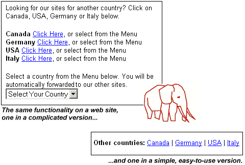
A good sign of a Pink Elephant is being verbose, being redundant, and being self-referential without admitting to it. If the help text reads “Click on Open Video to play the movie”, then one should of course make “Open Video” in that sentence be a link that does just that (open the video). One would then realize one doesn’t need the surrounding text.
Another Pink Elephant comes in the form of explaining multiple interfaces to solve the same problem. For example, to follow a link you may right-click the link and choose from the context-menu, you may left-click the link, you may keyboard-tab to it and press return, or you may have another device under your control which solves this simple task (it’s a task so simple we rightfully ridicule people writing “Click here"* or similar as link text).
But of course, you typically don’t want to use all of these approaches, you use your favorite one. Explaining all of the approaches would only confuse you. Yet, you will often find explanatory texts that go like “You can either right-click the image to save it, or ...”. If we can, we should avoid explaining, or even referring to the interface, on a web page. If we can, we should also restrict the interface to the set with the least possible options.
*One of my favorite “click here” help texts, and one you should have seen before if you like to shop online, is “If you’re not Philipp Lenssen, click here” (replace “Philipp Lenssen” with your name.) This is the welcome message on Amazon. What does it actually mean? It’s not a Pink Elephant, but intended to be a user-friendly way of saying “log out” (implying you can log-in again with another name).
Possibly the most annoying Pink Elephant (for those who care about usability) is the miles-away explanation. You know you hit on one if at the bottom of the page there’s a note to “click on the top right of the page to navigate”. Whoopie, welcome to the Lunatics Club and take a seat.
Joel Spolsky says: “Every time you provide an option, you’re asking the user to make a decision.”
He also says: “Users Don’t Read the Manual.”
He goes on to say: “In fact, users don’t read anything.”
Don’t forget when you’re providing content, you talk to readers. When you provide interfaces, you talk to users. Even though both channels may appear on the same page, we shouldn’t confuse them. If brevity is the soul of wit, then usability is all about being witty.
Did you spot a Pink Elephant online lately?
Released After Googling
“Iraqi militants who kidnapped an Australian reporter in Baghdad and threatened to kill him Googled his name on the Internet to investigate his work before deciding to release him unharmed.”
– Mike Corder, SFGate.com, October 19, 2004 [Thanks Anthony P.]
DHTML Lemmings
Apparently this browser-based version of the classic Lemmings game is DHTML-only (a mixture of JavaScript, CSS, and HTML). [Via Hotlinks.]
Attention.xml
“[On] Bloglines there are 2700 people who subscribe to my weblog. That’s cool! But what’s not cool is that Bloglines, and the other clouds that are caching weblogger’s data, like MyYahoo, is able to track all the clicking information (they know where my 2700 readers click) but they aren’t sharing that data with me or the other webloggers that are subscribed to on Bloglines or Yahoo.
Attention.xml is the answer to this problem.”
– Robert Scoble, Gillmor Gang talks about attention.xml, among other topics, October 19, 2004
Technorati has a little interface which outputs Attention.xml, and they also have an Attention.xml Wiki entry available summarizing this open format.
>> More posts
Advertisement
This site unofficially covers Google™ and more with some rights reserved. Join our forum!