Tuesday, May 24, 2005
GotLogos Finished Their Designs
Recently, I announced to sponsor four logos via GotLogos.com. In order to get the most “realistic” results, I did not mention to GotLogos I intend to review the service in my blog, nor do they know about this blog unless they found out otherwise. (All I told them was that I want a logo for a friend, and what kind of logo the friend would prefer.) And here are the logos; they took some days to finish but all arrived on the promised day. The deal is simple: it’s very cheap at only $25, but revisions cost $10 and the logo is otherwise non-refundable. Is the risk worth it? Let’s see...
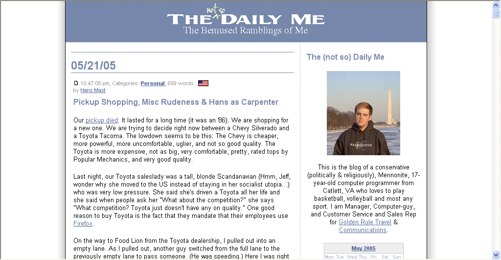
The (not so) Daily Me
Hans Mast of HansMast.com wrote: “This is the blog of a conservative (politically & religiously), Mennonite, 17-year-old computer programmer from Catlett, VA who loves to play basketball, volleyball and most any sport. I am Manager, Computer-guy, and Customer Service and Sales Rep for Golden Rule Travel & Communications. (...) I really dont care what kind of logo. Anything that looks nice and goes along with my sites theme.”
Here’s the new logo:

Other versions that were included: Mock-up, Small, Small transparent, Large transparent.
All in all, I think this is a great job. Designer Daniel said: “Thanks much! Blogs can be difficult to design for so let your friend know I didn’t want to do something too flashy and ruin the [aesthetic and understatement] of his mission. Hope he likes this!”
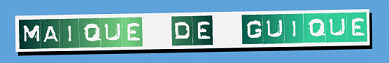
Maique de Guique
Maique Madeira of Maique.com/blog said (case adjusted): “I have a small photojournalism site (www.maique.com) and I host my blog. Its just a way to stay in touch with my friends, nothing more than that.
I did the site and the blog in my spare time, just like thousands of others.
I would like a logo for the blog (www.maique.com/blog). I must warn you that both site and blog are in portuguese.
The blogs name maique de guique is a phonetical translation (?) of the english ’mike, the geek’.
As I told you the blog is a place to show my friends some of the photos that dont make it to the paper and some that I really liked, mixed with some very low quality mac tips for some others. Its a new blog and, as such, I would love to have a nice logo to get it going.”
Here’s the finished result:
Other versions: Large, Small transparent, Large transparent.
Again, a cool logo, and it shows the variety of styles available.
Designer Daniel said: “I have to emphasize that blogs can be tough because most bloggers don’t want something overtly graphical or cheesy looking. So I hope your friends understand that I am trying to do something within the font faces and layout that gives some personality to what they are doing.”
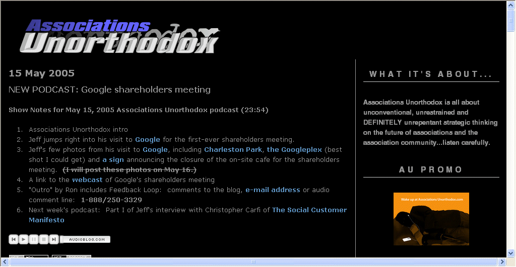
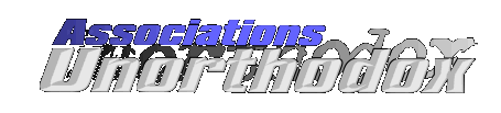
Associations Unorthodox
Jeff De Cagna of AssociationsUnorthodox.com wrote: “I would like a logo for my podcast blog, Associations Unorthodox, which is on the web at www.associationsunorthodox.com ... I have a banner that I created myself on the web, but Id really like something that I can use in other ways, such as for merchandise or on the PowerPoint slides. The logo should work against both black and white backgrounds.
I find it difficult to describe with precision what Id like the logo to be, but I suppose Id like it to be provocative, edgy and visually appealing. I hope that provides enough guidance.”
Drum-roll... the logo:

Other versions: Mock-up, Small, Small transparent, Large transparent.
It should be said here that I only gave away a single logo, so the option to make it work on both black and white could not be solved 100%, naturally. The designer still provided a transparent GIF. In any case, I hope Jeff will like it.
Designer Daniel added: “I wasn’t sure what to do with the dual background request but tell your client/friend that we can adjust this for a pure white background. It may require another logo fee though as I think all the colors might have be traded out as well as some of the fx might have to be redone.”
Social Patterns
Michael Nguyen of SocialPatterns.com provided these details for the logo: “I run a search engine blog at www.socialpatterns.com
Id like a minimal logo with the color scheme already present on my site. A cool icon image as part of the logo would be great.”
His logo:

Other versions: Small, Small transparent, Large transparent.
Another nice logo. I’m not sure I’m the only one who sees a smiling face inside the icon. Michael’s color scheme suggestion was respected.
In the end...
Getting the GotLogos.com was a lot of fun and there might be a second round coming. (If you are interested, please wait for it to be announced here before you ask in the forum.) The overall quality of GotLogos.com, especially considering the low price, is very good. I appreciate to hear your comments on the four logos above and I’m curious who of the four will or won’t use them for their blog!
>> More posts
Advertisement
This site unofficially covers Google™ and more with some rights reserved. Join our forum!