Friday, September 29, 2006
Google Reader Redesign
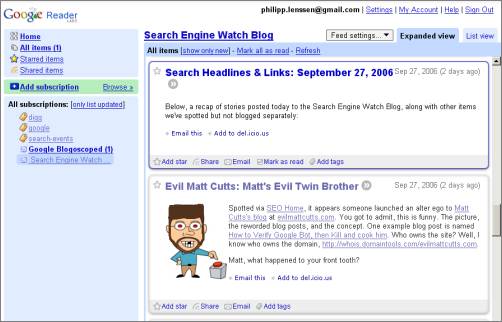
Google’s RSS reader underwent a major redesign (take a look at the video [WMV] to get an impression). Now, the subscribed feeds and most other navigation items are showing to the left. Google wants you to think of the new design as “your inbox for the web.”
Indeed I find the new design a big improvement over the old, more esoteric approach. Sometimes being novel is a hindrance for usability, and the new approach – more old-fashioned, and more in the style of Bloglines and other feed readers – feels more easy to get used to.
The settings dialogs also changed and it’s now much easier to e.g. remove all subscriptions at once, or manage all of your tags. Note that Google indeed calls them “tags” now, not labels, following up on industry-wide usage. However, as UK programmer Tony Ruscoe notes, in other places inside Google Reader they’re called “folders.” A consistent naming convention would be nice here, and as Google Reader displays the categories as folders, they might just stick with that metaphor. (Of course, cross-service consistency is an issue too – Gmail calls these “labels.”)
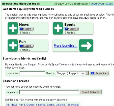
Google also made exploring easy. When you click on “Browse,” you are presented with what Google calls “bundles.” Basically these are topic clusters like “Sports,” “Technology,” “Food,” “Thinkers” or “Google-related” (hey, bring us “Microsoft-related” and “Yahoo-related” too if you want to stay objective, Google). You can then subscribe to the whole bundle, which will be sorted into a folder/ tag, or subscribe to individual feeds from the bundle. If you’re not happy with the preselected feeds you can also locate friends’ feeds on sites such as Blogspot or Flickr, or simply search for a feed.

In some of the dialogs (like the “browse” page) you can see a slight tendency on Google’s part to be overly verbose – when it comes to interfaces, “users don’t read,” as usability expert Joel Spolsky put it. Near-redundant phrasing like “Search and browse - You can also search for feeds by using keywords” when the interface already includes the words “keywords” and “search for feeds” (enough to understand what’s supposed to happen) will only make users skip the text, while adding clutter to the page.
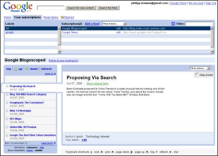
The old interface

Google’s old Reader interface
While Google says their plan is to “retire the old interface in the near future” (they’re still listening out for feedback on this new version), at the moment you can still revert back to the old Google Reader design by clicking “revert to previous version” in the Settings -> Preferences tab.
The discussion started in the forum.
[Thanks Spencer H., Haochi, Philipp K., Yannick Stucki and Jennifer DeLeo!]
>> More posts
Advertisement
This site unofficially covers Google™ and more with some rights reserved. Join our forum!

