Monday, February 5, 2007
Joe’s Google Redesign: Homepage Usability
Joe Critchley aka Mambo got his first computer when he was 8, and started making web pages when he was 11. He’s currently working as freelancer doing stuff like HTML, CSS, PHP and MySQL, as well as web design.
Here are the changes, and the reasons behind them:
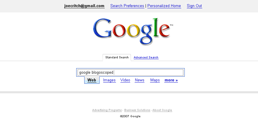
- Reorganised Google Account links, with centre alignment, to avoid too much white-space on large monitors, and merging the ’My Account’ link into the e-mail address, because it directly relates to that particular user only.
- When a user is about to search, they know what they want, but they don’t always know what kind of result it will be (e.g. a video). Therefore, it would be more logical to have the search box first, and then search types.
- Separated ’Advanced Search’ and ’Preferences’, because they didn’t belong together, and removed Language Tools, so it could be accessed through “more”.
- Made search stand out, by including a drop shadow and two tabs for Basic Search and Advanced Search.
- Faded-out footer links, because they’re not relatively important.
Overall, with these small but significant revisions, the design should feel more aesthetic, yet more efficient, with the removal of the search button and reordering of the page’s elements.
Also see the previous redesign.
>> More posts
Advertisement
Advertisement
This site unofficially covers Google™ and more with some rights reserved. Join our forum!