Friday, October 26, 2007
Preview YouTube Design

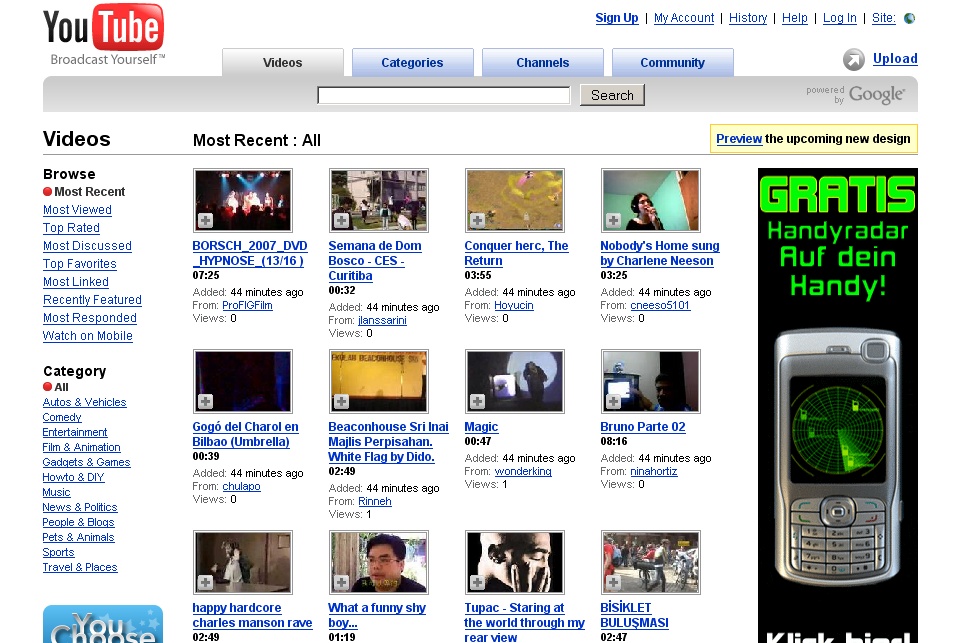
I don’t know if this is new; when you currently visit the YouTube video channel homepage you are being offered to try out a preview of an upcoming design. In the new version, things are a bit larger, a bit more red, and the left-hand navigation bar is removed. YouTube asks you to send feedback on this design to browsefeedback@youtube.com.
I like the new design a bit better, but then again I liked Google Video’s layout better than YouTube’s. However, compared to the old design, especially the red color gives the page a stronger identity of its own... which may be a subtle hindrance to allow diverse communities to evolve. The less you express, the more room you leave for interpretation, and if you are able to freely interpret what a site “means” the barrier for identification (and thus loyal interaction) is lowered. Along the same lines, it takes away focus from a video if the red color is supposed to be consistent... a video should be the “star” on a YouTube page. Plus, by cleaning up parts of the navigation, maybe YouTube also removes some of the “cozy clutter” that helps community building on “graffitti"-style sites (the ones like MySpace, which often have amateurish-looking, seemingly homemade designs). But that’s just speculation, and it might well be it’s more about (community) features & marketing than design when it comes to communities...
[Via Google Discovery.]
>> More posts
Advertisement
This site unofficially covers Google™ and more with some rights reserved. Join our forum!