Tuesday, March 4, 2008
Low-Usability Wordpress Dialog
When you comment at a Wordpress blog you can subscribe to emails alerting you of comments made after yours, a useful feature. When you want to unsubscribe, though, you’ll see a good lesson in bad interface design.
First, you will see all your posts and can then check every box. An overly verbose help text and title – users don’t read – introduces the dialog. Then, instead of a “select: all / none” short-cut for the boxes it reads “Invert Checkbox Selection”, a more exotic concept:

Once you hit the “Remove” button, the next dialog returns a big red warning message telling you... that you are not subscribed to any messages:
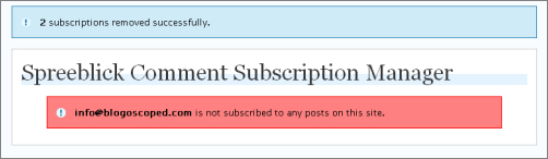
It’s easy to think you did something wrong, but if you look at the dialog for a second longer you’ll notice that in fact everything did work right; it’s just that the actual success message is printed less visibly above the title (outside what you learned to perceive as content area in the previous dialog), and red is a bad color in a dialog page that should mostly first communicate the success of the just performed action.
(Again, minor issues in themselves but a good lesson of what happens when the designer misses to ask crucial questions like what do users want, what do they want mostly, how much time do they have, what do they know already, what do they expect, what might be misunderstood, etc. If you’re building a full-fledged application, piling up too many troubles can even make users leave to the competition, at least if competing products are easily available.)
Update: James in the comments clarifies, “That functionality is not provided by the stock Wordpress, it’s a plugin called ’Subscribe To Comments’”. [Thanks James!]
>> More posts
Advertisement
This site unofficially covers Google™ and more with some rights reserved. Join our forum!