Wednesday, March 19, 2008
Google Charts API Update
Google updated their charts API, which they first released back in December 2007. First of all, the old limit of 50,000 queries per user per day has been removed (though Google asks you email them if you receive more than 250,000 queries a day so they can better scale this).
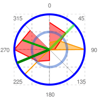
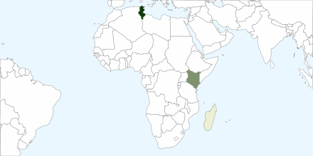
Also, there are several extended or new features. Among them are radar charts, sparklines, and maps. The last one is perhaps the most interesting, as it lets you display and color a map. While you can already use the Google Maps API for certain needs, this is a much more minimalist map that might come in handy for illustrations, games, traffic visualization and other things. As usual, generating maps or any other chart type consists of simply formulating a special URL.
[Thanks Colin Colehour and Roger Browne!]
Update: Roger Browne in the forum comments:
I'm interested to understand the business case behind this. Google is essentially saying "You never need to serve another chart again. Feel free to use our processing power and our bandwidth, no matter how huge your requirements are". There's got to be something more to this than "we thought it would be cool" (even though it IS incredibly cool).
My best guess is that Google gets two benefits: semantic data to crawl, and lots of behavioural/demographic data to help them target their ads better.
Google gets the raw chart data – the figures, the titles, etc. Google now has an easy way to index that data in their search results, without needing to try to analyse the PNG graphic files. So if you search for "third quarter cheese sales in London" you can be sent straight to the page containing that chart. It's a small but very useful step towards the semantic web.
Google also gets the behavioural/demographic data. Doubleclick has been doing this for ages with those 1x1 pixel graphics. Google has found a way to do the same thing in a somewhat less evil way, by providing a user benefit. Not only that, Google will have a way to track user behaviour over pages that don't contain Doubleclick ads, provided the pages contain a chart (or a map, or a gadget, etc).
Yeah, it's gotta be something like that.
I wonder if it's also a "first high-traffic test case" for the roll-out of a massive Akamai-like content-distribution system. Something like the "Internet 2" or similar that appeared on the famous whiteboard? The thing that Google hired Vint Cerf for (they must have hired him for something tangible over and above "internet evangelism").
[Thanks Roger!]
>> More posts
Advertisement
This site unofficially covers Google™ and more with some rights reserved. Join our forum!