Tuesday, March 25, 2008
Yahoo Redesign With Centered Logo
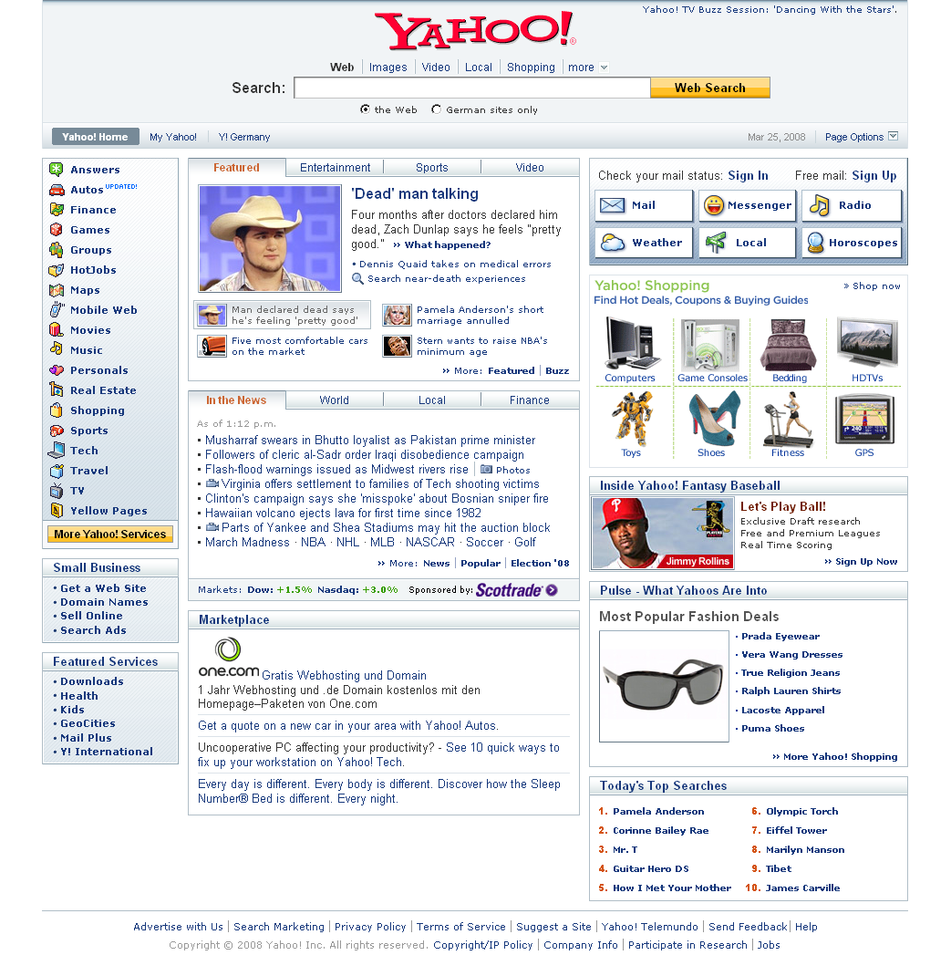
The last time the Yahoo homepage saw a major overhaul was in May 2006. Now, another redesign moves the logo from the left side back into the middle again (Martin in the comments notes this was already rolled out for some time in UK/ Ireland). Those looking for a more uncluttered homepage however still need to go to search.yahoo.com or google.com.
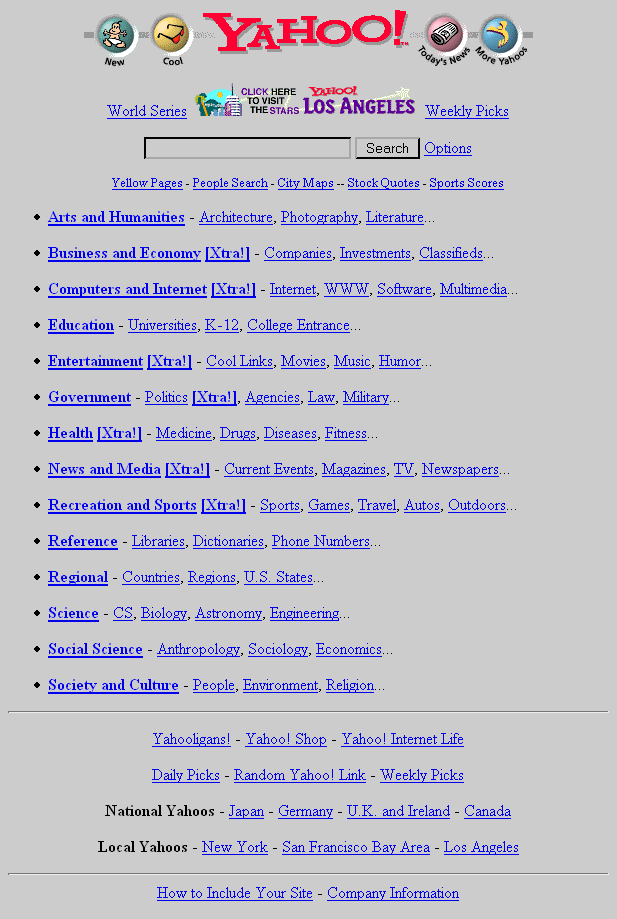
Below is a bit of visual history of Yahoo’s various layouts from the 1990s to today*. Yahoo’s layout was once quirky – with homemade looking cartoon icons, like a baby representing “new” – but (as opposed to what happened with the layout over at Google.com) became a little more serious as the company grew.
[Thanks Brinke!]
*Note that in the early days, Yahoo’s homepage didn’t define any background color... which back in the mid-1990s, depending on your browser and settings, would default to gray. Update: Peter comments, “Yeah, but the input [areas] were not gray, and the 3d shading was different.”
>> More posts
Advertisement
This site unofficially covers Google™ and more with some rights reserved. Join our forum!