Friday, May 30, 2008
Glimpses of a Google Maps Redesign
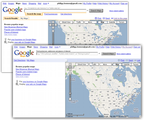
Google Maps is showing a redesign here, though I don’t know in what occasions it shows and whether it’s experimental or meant to go live for everyone. At the moment in Firefox (but not Internet Explorer, and also not in Firefox on another computer) I’m seeing the orange tabs gone; instead, there’s now a light blue bar on top with plain blue links reading “Get Directions” and “My Maps”. The search examples are now printed in gray inside the input box itself, as opposed to above it. A slight shadow effect makes the map area look embedded in the page, and it’s now spanning towards the right and bottom browser limits without padding. I think the new design looks a bit lighter and simpler.
As before, since some time, a “More” button in the map lets you browse photos and Wikipedia articles overlaid on the map. (And the easter egg of entering niniane kicks ass – a reference to Google employee Niniane Wang – still works, too.)

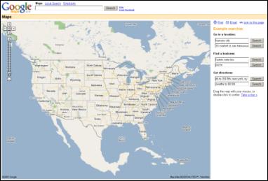
When Google Maps was launched as a Labs project in February 2005, it also didn’t have tabs, as above screenshot of that time shows (also see a larger version from October that year). Tabs were only to be introduced in 2006... and back then, the side bar was to the right.
Update: Here’s a statement from Google which Google Operating System got earlier this month: “We’re running the new UI as an experiment, so only a small percentage of users see it. If people like it better than the old UI then we’ll launch it to all users after cleaning up the bugs and incorporating any changes based on feedback from the experiment.” [Thanks Tony!]
>> More posts
Advertisement
This site unofficially covers Google™ and more with some rights reserved. Join our forum!

