Friday, July 25, 2008
How Google Looks for the Colorblind
By Tony Ruscoe & Philipp Lenssen
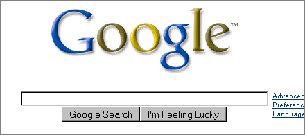
According to the Colorblind Web Page Filter, above is what Google.com looks like for users with protanopia (red/ green color blindness). Perhaps Google should run this as their logo one day to raise awareness of color blindness. Out of interest, does that logo look normal to anyone here/ is there anyone who’s colorblind here?
The Colorblind Filter site is a bit slow at the moment but if you created a website and you’re not color blind, you can check how well your intended color scheme fares. The site also has more information on how to select safer colors.
[Via Paul Buchheit.]
>> More posts
Advertisement
Advertisement
This site unofficially covers Google™ and more with some rights reserved. Join our forum!