Tuesday, January 6, 2009
Gapminder World Chart Maps Health, Income
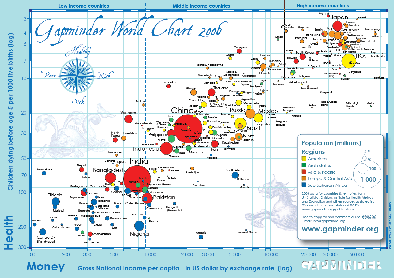
Google-acquired Gapminder published a different kind of world map in November last year. While there’s a compass and a sea monster on the map, the directions are not North and South, but Healthy and Sick, and not West and East, but Rich and Poor. The data the visualization is based on is from 2006. You can access the PDF of the full image from Gapminder’s download page, and I’ve copied it here as PNG image.
[Image Creative Commons licensed by Gapminder.]
>> More posts
Advertisement
Advertisement
This site unofficially covers Google™ and more with some rights reserved. Join our forum!