Tuesday, March 17, 2009
When Bigger Is Not More Clickable
Want to make a link really, really visible? One thing to keep in mind: bigger is not always better. Sometimes, really big buttons – without underlined text – look more like info banners than things to click on.
Take this OpenOffice download page, for instance:
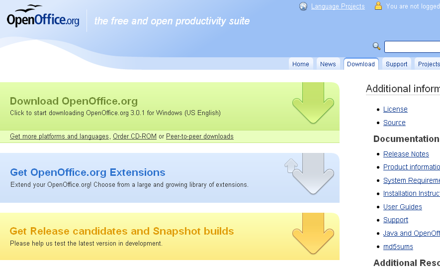
I was looking for a link but the first underlined text in the content area reads “Get more platforms and languages”... not what I’m looking for. It took me another second or two to realize the big green “Download” area itself was the button, albeit the arrow in it pointed to something below the area (the arrow is a metaphor for “down-load”, but that’s a retrospective insight). Losing a second or two is nothing serious usually, but in usability land, it’s a noticeable time span... in particular as the designers of OpenOffice apparently aimed to make the link really visible. In a website or larger app, all those micro-barriers of a second or two of delays add up to a feeling of frustration you may not even be able to pinpoint to one specific issue.
How could the page be optimized? I’m just guessing (and I don’t have access to the OpenOffice template and stats to find proof), but I figure the old-school pattern of “blue, underlined text” would look more clickable – I’m additionally using a bullet icon in order to make the text look less like a headline:

Here’s another page I recently came across which uses a button as a link, making for – at least in this specific design – a somewhat decreased usability. It’s the download page to a Friendfeed desktop widget:

Again, I was looking for a simple download link, and I first scanned the text area for it. Why on earth, for the first second or two, did I ignore the big button to the left reading “install now"? I don’t know, but my guess is that I subconsciously understood it as a screenshot – a screenshot perhaps telling me where to click when I start the executable that I’m about to download (a download that surely must be linked somewhere in the main text!). This kind of “where you need to click during the setup process” screenshot is quite common on download pages. Plus, the positioning next to the actual screenshot to the right might have triggered me to group the elements and assign the same meaning to them. It’s another micro-problem you might have faced before: a site which does not sufficiently differentiate actual interface from explanatory screenshots of interface. This can cause two modal errors: you’ll ignore the actual interface, or you may try to click on a screenshot of an interface. (The story, if you had to tell it, is no drama – it’s just a simple “Huh? ...Oh.”, and it may only apply to a percentage of users in a percentage of contexts... but it still means lower usability.)
Now, some people may find big bad buttons more clickable in comparison to plain blue links. Well, the conclusion may be straightforward if you find that to be true: you can combine the two approaches, either by using a button in which the text is underlined, or by offering one of those underlined text bits somewhere in the close vicinity of the button. Another good suggestion is to simply not make the button too big, because that enhances the understanding of what it is (a button) versus what it isn’t (some banner or illustration).
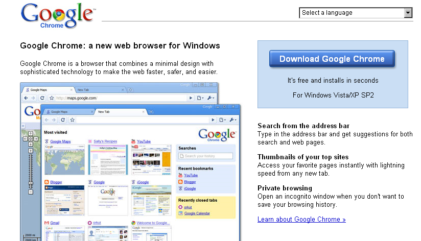
The Google Chrome download page is a relatively good example of a button that’s rather obvious and clickable, perhaps due to its bevel, sizing, surrounding box, and positioning (perhaps the blue button color helps as well, as blue often equals “clickable”). A button may also help get the point of a download across as it may be more strongly associated with “starting an action” (downloading, printing, installing, ...) than with “going somewhere” (to another webpage, that is):
>> More posts
Advertisement
This site unofficially covers Google™ and more with some rights reserved. Join our forum!