Friday, November 20, 2009
Google to Test New, More Colorful (and Permanent) Sidebar
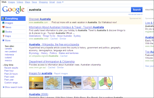
Google is rolling out a design prototype to some users which will have a permanent new pane to the left hand side. Within that pane, as the screenshot by Search Engine Land (with more coverage) shows, there will be sections such as “Everything”, “Images”, or “Video”, as well as related search queries and more fine-tuning options. Clicking “Images” switches to what Google internally calls the images “mode”, meaning the results will now consist of images. “By default, Google guesses at the modes it thinks are most relevant to your search,” Danny Sullivan explains. The top bar of the prototype still contains navigation links like images and video, too, causing a bit of redundancy.
I also got hold of a sprites image that looks like it’s used for this prototype (a sprite image is referenced by a stylesheet, and quicker to transmit because it only needs to be downloaded once, and can then be cropped as needed for different icons on the client side). Have a look, you can see the new Google results page logo and some of the pane icons, among other things:
![]()
If Google doesn’t switch its place, this image is hosted at
google.com/images/srpr/nav_logo3w.png
Here’s another one (going by the number 5; a number 4 is available too):
![]()
If this is ever rolled out for everyone – right now, around 1 - 3% are going to see it, Search Engine Land says – it’s going to be a pretty major design step. Right now, the left hand pane still needs to be manually expanded, which probably means many people ignore it. I guess the question for the new harder-to-ignore pane will be whether it’ll start to get in your way or not. For many queries, we may just be looking for the best website out there, or a quick bit of textual information; for other queries, we may well like to have richer results. Right now, Google already automatically sometimes shows richer results and sometimes more text based ones – the “universal search” approach, though Google’s Marissa Mayer finds it can cause unexpected “Jazz" style result design that slows searchers down. I guess for the new constant sidebar there’s both the chance that it causes more organization, or more clutter. If any of you stumbles upon this prototype, please let me know via email of the contents of the Google.com cookie named PREF so we can reproduce the test and have a try ourselves!
[Thanks Ionut! Image CC-licensed by Search Engine Land.]
>> More posts
Advertisement
This site unofficially covers Google™ and more with some rights reserved. Join our forum!