Tuesday, November 20, 2007
What If Gmail Had Been Designed by Microsoft?
Today I want to ponder the question: what if Microsoft, not Google, had created Gmail? What would be the differences in that web mail client for users today? What if we apply some of the same design rules that brought us Hotmail, for instance?
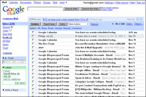
To start, here’s the current Gmail homepage after you log-in:
First of all, we need to rebrand the application name to something longer. Let’s call this Windows Live Gmail, and add some of the visual elements connected with Windows. Also, as in Hotmail, there needs to be less space for the email subjects to make place for a reading pane, which is full of verbose explanatory help text*:
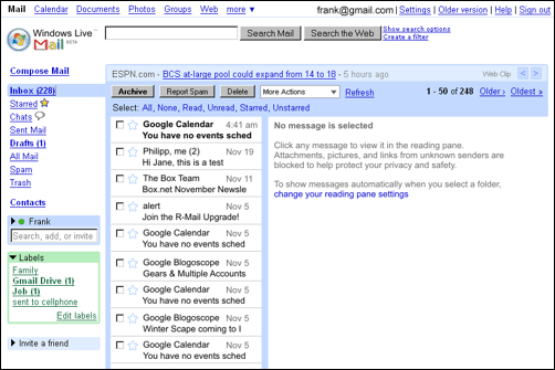
*Not shown in the screenshot, we’ll also throw in a security measurement that will prevent you from clicking on links in emails, unless you discovered the switch to mark a mail as safe. Another security measurement we’ll add is that you won’t be able to log-in with just username anymore but are required to enter the full username@gmail.com. Furthermore, we will change the browser URL from http://gmail.microsoft.com to the more professional looking http://by114w.bay114.gmail.live.com/mail/mail.aspx?rru=home.
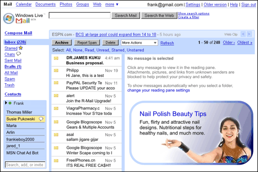
For another design iteration in our inbox, we will need to camouflage the checkboxes next to the messages by putting a mail icon on top of them. Also, we need to break up messages from conversation threads into their individual parts. Furthermore, this version of Gmail needs to change from context-aware text ads to context-unaware graphic banners, which we’ll require to carry at least one clip art. Gmail currently has a chat box which I don’t use and thus find annoying, so I think we can build on that and expand it to a more full-featured chat widget, replacing the labels box. We’ll also adjust the spam filter slightly to show a couple of more bulk mails in the inbox:
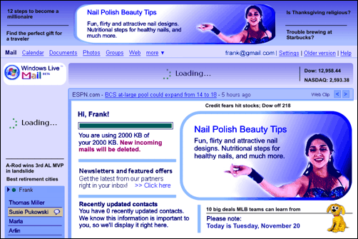
There’s still not enough banner space available though, so let’s add a top row for ads and move the rest a bit more down. Also, to go back to the real Microsoft spirit, the inbox will now carry a maximum of 2 MB of messages – that was the amount Hotmail offered when Gmail was released with 1 GB in April 2004. Also, Microsoft-style, the actual start page of this service will not be the inbox, but a “welcome” splash screen. Please imagine the ads blinking at this point:
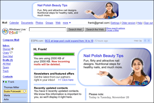
Somehow, this still misses part of the Microsoft feeling – the current design is just too bright & light, and it doesn’t have enough glamor. I’ll darken the colors a bit and add some smooth shades. Also, admittedly, Hotmail is a bit slower than Google’s competing service, so we’ll add some “loading” messages. Usually there’s less focus on unclutteredness with the Redmond guys, so we’ll add some MSN news bits and “special offers” where space is left. Plus, to increase user lock-in, let’s get rid of the “sign out” link. I’m also putting less emphasis on search, moving the box to the bottom right and replacing it with a dog:
Voila, we’re done... that was easy! Your potential, their passion. Coming up tomorrow: “What if Microsoft had designed Windows Vista.” Stay tuned!
>> More posts
Advertisement
This site unofficially covers Google™ and more with some rights reserved. Join our forum!