Monday, June 2, 2008
Kevin Fox of Gmail & FriendFeed on User Experience Design
From 2003 to January 2008, Kevin Fox worked as a user experience designer at Google, designing such products as Gmail, Google Calendar, and the second version of Google Reader. He’s currently working at FriendFeed. I met Kevin for a three-session instant messenger chat interview (edited for clarity, and both parties had the chance to make minor rewordings later on; see more about the process. Please note this is almost exclusively a foray into design & usability; topics like Google censorship, privacy and more are discussed elsewhere on the site).
Can you tell us, what do you do at the moment, what is your job at FriendFeed?
My official job title is “FriendFeeder”. At the moment that’s everyone’s job title. The idea being that we shouldn’t feel limited in how we contribute based on a job title or a set of responsibilities. In practice, I think a lot about the user experience and visual design a lot.
Do you also do programming? I noticed you seem to be both a developer and a designer, is that right?
In the past I’ve done both. I used to be a web developer and technical lead for a few different companies like Levi-Strauss. Back then I would do a lot of front-end engineering and database integration.
Nowadays I do a lot less of that. It’s mostly about letting people focus on the areas that they excel at. I’m not a pro at Ajax implementation, but I have a firm grasp of its capabilities, so I design toward that. That said, I’m learning Python (I’ve been more of a LAMP [Linux, Apache, MySQL, Perl/ Python/ PHP] engineer in the past) so I can contribute directly to the codebase rather than rely on someone else coding my smaller ideas just to see how they work in practice.
The ability to touch the code is especially important here at FriendFeed, because while the visual experience is currently pretty simple, the important interactions are very subtle, so being able to play with small functional changes in a working environment is vital.
So you add something to try it, and then roll back the change if you don’t like it?
We each have our own instance to play with, so I can try something and roll it back or modify it on my own instance, and when I’m happy with it I can ask the others to bang on it and see what they think, and we can then roll it out to a wider audience or not.
Do you also invite outsiders to test new features, to see how people not so involved in the site use it?
Sometimes, but usually only for more significant features, especially features that people need to use for a few days or weeks to know how they really feel about it. Smaller stuff we can just roll out and, if it turns out we made a mistake, iterate on quickly.
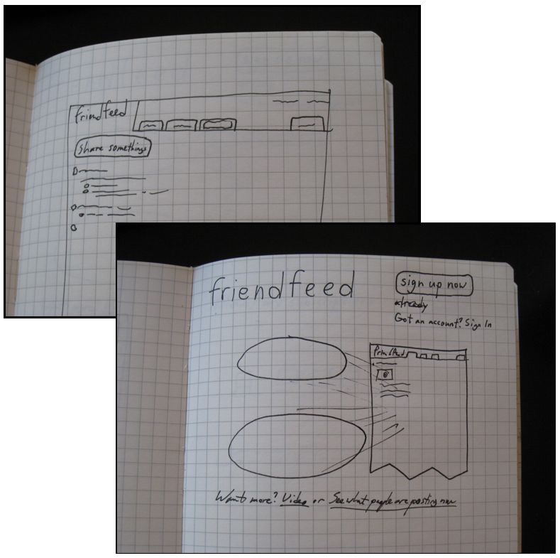
Kevin Fox’s notebook showing a FriendFeed scribble.
What tools do you use to prepare a change, something like Photoshop? Or scribbles?
Things usually start in my Moleskine notebook or the ubiquitous post-its that litter my desk. After that I usually use Fireworks to see how things ’feel’ and to get opinions from others. I prefer Fireworks because it’s both bitmap and object-oriented, so I can manipulate shapes after the fact more easily. It also does a much better job of anti-aliasing (this is a Photoshop pet peeve of mine).
The other way I’ll try small changes is to view source on a FriendFeed page and modify the output source just to see how things look. It’s faster than changing the underlying source code when I just want to see how something looks and I’ll probably be throwing it away.
Working in user experience design
“Most of what I learned before grad school was on-the-job and I always felt a little self-conscious telling people that my design decisions were right because my intuition was better than theirs so I left Yahoo to get a more scholastic grounding in [Human-Computer Interaction].”
How much of your job did you learn at university, how much by doing it at work later on?
Actually, a good chunk of it was learned earlier on. I spent 11 years getting my bachelors degree from UC Berkeley because I would stay for a year or so then leave for a year or more to work for a web design or consulting company. When I finally did graduate I planned on going immediately to grad school but in addition to getting into the HCII [Human-Computer Interaction Institute] program at Carnegie Mellon I got offered an interaction design job at Yahoo. Both were dreams come true, and Carnegie Mellon would let me defer for a year (Yahoo wouldn’t) so I worked for Yahoo for a year before going to grad school.
Most of what I learned before grad school was on-the-job and I always felt a little self-conscious telling people that my design decisions were right because my intuition was better than theirs so I left Yahoo to get a more scholastic grounding in HCI.
My time at Carnegie Mellon taught me to think deeper about the ’why’ of design and about how a user’s interaction and expectations with a product change over time as their experience, comfort, and needs change. So the short answer is that it’s a mix of both. Working at Google after grad school was an amazing experience because I got to put in to practice my thoughts about designing products that people will use for 10 years instead of 10 days.
Human-Computer Interaction... is that the general field encompassing things such as usability, accessibility, perhaps visual design?
It means different things to different people. My interest has always been in computer-mediated communications. People talking to people facilitated by computers. Specifically at Carnegie Mellon, HCI referred to the designing of systems in ways that were usable and useful to people, usability research, and the actual development of front-end systems. My emphasis was on the first area.
So how do you tell someone what is right in user experience? Are there ways to deliver proof?
There are certainly many ways to assess and validate designs, but user experience is rarely black and white. The biggest obstacle to an empirical ’this is better than that’ judgment is what you’re optimizing for. There are a lot of different ways of doing the same thing, and while there are a whole lot of situations where one design solution is better than an alternative in many ways and worse in none, there are even more where there are tradeoffs.
Take vehicular transport for example, one of the best examples of designs that have been iterated so much that now even minor changes are considered huge. Yet there are still motorcycles, sportscars, and SUVs. Which one is ’right’?
All too often people are looking for ’proof’ that their design is right. When you let go of bias for your own design it’s liberating because finding out where your design could be better is so much more valuable than finding enough evidence to push the idea that yours is ’right’.
Getting involved with FriendFeed
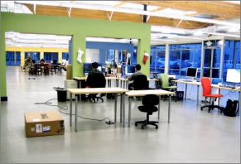
The FriendFeed office space in the background, in a view from the neighboring Polyvore offices.
I wanted to talk a bit about what you did so far with FriendFeed. First of all, how did you get involved with FriendFeed?
Well I’ve known the founders for quite a while. Since Gmail was my first project at Google, [Paul Buchheit] and [Sanjeev Singh] were two of the first people I met there, and [Bret Taylor] and [Jim Norris] and I had worked together a bit while I was on Google’s UI Review committee.
“If you hire people who are very good and very interested in the work then you don’t need a lot of the cruft that so many companies have that are designed to make sure people are doing what they should be doing.”
I was on leave from Google for a couple months and came by the FriendFeed office for lunch and to catch up with them. I’d played with FriendFeed before but I wasn’t looking to join up. Talking with them about what they’d done and what their vision was, I was really taken up with the idea of trying to make something new, something that would have to swim on its own merits without the benefit of the instant exposure afforded to any Google product.
More than that, I was taken by the kind of company Paul and Bret were trying to create. Google is a unique and fantastic place, and even coming out of that culture the FriendFeed founders wanted to iterate and improve upon it. A big part of FriendFeed is that we’re all really excited about the journey. We try hard not to put in place false constraints. If you hire people who are very good and very interested in the work then you don’t need a lot of the cruft that so many companies have that are designed to make sure people are doing what they should be doing.
Interesting. Before we delve deeper into FriendFeed, what is it? Paul Buchheit once started a “describe the site in 2-8 words” thread, where you answered too...
We’re still looking for the right 2-8 words. :-)
In a slightly larger nutshell, FriendFeed is a service that helps people keep up with and discuss what their friends are saying, making, and sharing online, wherever or however they do it.
There are plenty of buzzwords like ’social aggregator’ or ’lifestreaming service’ that can apply to FriendFeed but don’t adequately describe it. It is in part an aggregator, grabbing items from a whole lot of sites where people share stuff (blogs, YouTube, del.icio.us, Twitter, etc.) and presenting you with the things your friends made or touched, but it also is a powerful communications tool, promoting discussion about those things.
If you’ve ever looked at the comments on YouTube videos you know how useless they are, and the comments on Flickr photos rarely result in conversations because people don’t go back to look at things they’ve already seen. FriendFeed tries to solve these problems, while also solving the problem of checking 37 different sites to see what (or whether) your friends have posted recently.
Problems social networks face
FriendFeed doesn’t pressure you... there’s no inbox that keeps filling when you don’t visit, there’s no friendship request dialogs...
Right. The idea of unilateral connections is an important one. People’s ideas of ’friendship’ differ and it’s not a good idea to, at the outset, ask a user to accept another person’s measure of what friendship is.
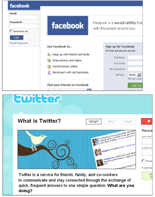
A site that visibly promotes how many ’friends’ you have turns friends into commodities, creating an economy where you are motivated to make as many friends as you can. That’s not a good idea because the utility of these sites suffer as social networks become too densely populated. Throw in the social implications of ’un-friending’ someone and you result in a cycle where the only way to solve the problem is to stop using the service and instead jump on to the ’latest’ social network where you can start with a clean slate. This is how we went from Friendster to Tribe to Orkut to MySpace to Facebook (with a few more or less along the way).
Facebook and Twitter. Duncan Riley once compared FriendFeed to other services arguing it “wins (by a small margin) on usability and scope,” but thought that “it’s still yet another service in a sea of similar startups.” A commenter to that thread said they liked the “simple GUI” (graphical user interface).
FriendFeed isn’t trying to convince you to friend everyone you know for its own gain. It’s about trying to make a well-balanced experience. One you can find value in for a very long time.
Are social sites like Facebook trapped in this conflict you describe, or can they change their site in the future to accommodate for this?
I think it’s definitely a solvable problem and maybe Facebook will solve it, maybe not. Twitter does a better job than most, actually, by drawing a distinction between ’friend’ and ’follower’.
The most important thing is to acknowledge that friendship isn’t binary, and that there are people who aren’t your friends that you still want to interact with, and people who are your friends that you wish you could ignore online. Users need these controls to tailor their experiences to what’s useful to them, and abstract these controls from ones that indicate to your friends ’how much you like them’.
FriendFeed design iterations
When you started at FriendFeed, what were your first steps? I mean I guess you started preparing your work space... what Operating System do you use by the way?
I use Macs almost exclusively. In the past I’ve used both Macs and Windows boxes, but since browsers are becoming so much more consistent cross-platform I can move to the Mac for most of my work.
It’s funny, actually. A few weeks before my start date at FriendFeed Paul asked me what kind of computer I wanted and what software I’d be using and when I came in my first day I’d found that Bret had set up the computer and installed and configured all the software I listed. I was so impressed. By contrast, Google asked me the same thing when I started 5 years ago and I told them I’d like a 12” Powerbook. When I arrived I had a desktop Windows box and a desktop Linux box. It ended up taking over three months to get my Powerbook. The situation has changed a great deal there now though. Macs have a huge foothold at Google and it’s easy for new hires to get a laptop of whatever flavor on their first day.
FriendFeed launched for an invite-only phase in October 2007. All but one of its employees are ex-Google employees (convincing some that it adds to the press the service has been getting). Above you can see the early FriendFeed (screenshot by Natchers.com) and today’s version.
At the time FriendFeed had no tabs and no blue background, to mention just the design differences. What were your goals now, and how did you tackle analyzing and improving the user experience for the site?
My most immediate goals when I started were to give the site a ’sense of place’, making it easier to see where in the site you were and what other placed existed. An important aspect of Gmail’s design was that the user always felt like they were on one page, and they were just changing things on that page, rather than navigating to other places. The sense of ’distance’ is important for user comfort so I sought to make the different areas of the site feel closer to each other. I don’t think we’re done there yet, but it was an easy refactoring that could be implemented quickly.
Nowadays I’m looking closely at the different models of how people use the site. When I was working on Gmail, I wrote up six profiles of how people use the product and used those to refactor the design to make it more useful to some while still respecting what was useful to the others.
I’m working on doing the same thing now with FriendFeed. Our product isn’t as mature as email was, so the usage patterns aren’t as predictable, and there’s always the hope that we’ll create a product that will allow for new, more powerful usage patterns than are currently available.
What kind of user groups do you currently see in FriendFeed? And how do you see them, through usage statistics?
It’s still a bit early to tell. A lot of people are still evolving how they use the site, and the tools people are building on top of the FriendFeed API are also changing the landscape a bit. Usage statistics are a big part of it, as well as surveys and interviews.
“One thing that helps us a lot is that we have a vocal subset of our community who will also notice and comment when the ’feel’ of FriendFeed changes. It’s not perfect because these vocal users represent a fairly specific user demographic, but it helps.”
At FriendFeed you seem to listen to user feedback a lot. By the way, do you have some kind of alert system when a new user signs up with the site? Like an office alarm ringing...
We talked about that a bunch. I love ambient displays of information, but the truth is we haven’t gotten around to that yet.
Back in February we talked about filling up a bucket with jellybeans that would each represent a user, but the numbers wouldn’t make it cost-effective. I still like the idea of a pool of rice and a robot that would drop a grain in every time we get a new user. But there are problems there too, like how do you deal with users who stopped coming back? And the mice?
Maybe I answered my own question. The trick would be to limit the mice’s diet to match the attrition rate.
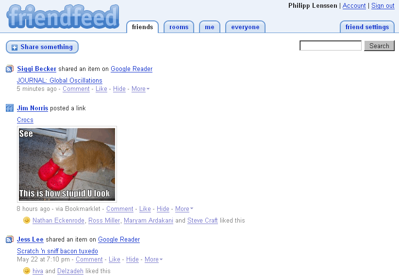
A Google search for [site:friendfeed.com] indicates around 170,000 FriendFeed pages are indexed by Google’s crawler so far. People at FriendFeed in the past discussed just how public the public discussions are, but the site now has private rooms, too. (On a side-note, while rooms were launched on May 23rd, this interview spanned a time from May 21st to May 27th.)
Heh. Could you list some of the other changes that were implemented then?
’Friend of a friend’ posts came out shortly after I started. It was nearly complete before that but I had the chance to make a few changes to the behavior. The whole new user experience was overhauled. The UI for posting directly to FriendFeed, profile hover cards, hiding single posts or categories of posts, ’twitbacks’, and a whole lot of small stuff.
Aren’t you sometimes scared that a new feature could “poison” the interaction, the community? For instance, if I remember right you guys thought long and hard before introducing the “x people are subscribed to you” note on the friend settings page... I suppose that ties in with your comments about friends as commodities...
A bit, but it’s not like cutting a parachute. There aren’t many changes that we could make that would be unstoppable once they started, and we keep a close eye on how new features or changes affect the overall experience when they’re rolled out.
One thing that helps us a lot is that we have a vocal subset of our community who will also notice and comment when the ’feel’ of FriendFeed changes. It’s not perfect because these vocal users represent a fairly specific user demographic, but it helps.
Like, lurkers might just leave and never give you feedback of what went wrong...?
It could happen in theory, but we’d definitely notice.
I suppose FriendFeed could change a lot in the future, not just in terms of the user experience, but also what the site is meant to be in general? Did Paul line out a longer vision in those first talks that is way beyond what people see at the moment?
Yes and no. We brainstormed and it’s clear that Paul has a lot of things he wants FriendFeed to accomplish, but it was just as clear that there’s not some sort of predetermined end product he’s setting out to make. We’re all shaping it in both the short and long term. I probably can’t say more than that.
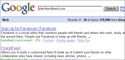
2003 – Starting to work at Google
The Google homepage over the course of time; the screenshots are from 1997, 2002, and today. Back in 2003, Google Inc. did yet have to face their IPO, release Gmail, enter the Chinese market with a self-censored search engine, and more. In a letter from 2004, the Google founders wrote Google “is not a conventional company” and that they “do not intend to become one."
OK. I wanted to jump in time a bit ...
... don’t we all?
... you started at Google in August 2003. How did you get hired, what was the interview process like?
I had a list of companies I wanted to talk to for a job after grad school: Amazon, Apple, eBay, Yahoo, TiVo and Google. I contacted most of them but hadn’t gotten to Google when a recruiter there contacted me after an associate product manager at Google had found my resume.
Marissa Mayer and Nathan Stoll were coming to Pittsburgh to interview people for Google’s Associate Product Manager program and so I met with each of them for about 15 minutes, after which there was a phone screen with one of Google’s UI designers. As it turned out, she was a student in a user experience design class I TAed [Teacher’s Assistant] for at Berkeley, which worried me because I was an awful TA (she agreed). But things went fine and I came out for interviews.
I discovered a few weeks before the on-site interviews that they were interviewing me specifically for the APM program, which surprised me because I had no desire to be a product manager, so I stressed that I wanted to apply for the UI design position, and I ended up interviewing for both, over two days a week apart.
Did Marissa again interview you for the UI design position or who did you talk to? And what kind of questions were you asked?
I met with eight or ten people over those two days. I had a longer interview with Marissa, spoke with nearly every member of the User Experience team, including Kerah Pelczarski who was 9 months pregnant (we actually interviewed on her due date!). Larry Page was the last person I met with.
The questions were completely across the map from interviewer to interviewer. The tone was the biggest variable. My favorite interviews were brainstorming sessions. Less appealing were the interviews where I had to demonstrate specific skills, including one where I was asked to design on a whiteboard, then demonstrate how I would modify the design in the face of some pretty harsh feedback, but that was the outlier.
First task at Google: Gmail
What was your first task at Google once you got the job?
Gmail. It was still a relatively ’need to know’ project with Google, which was very unusual in Google’s culture. After a few days getting settled in, my manager showed me the service as it was at the time and said they didn’t have a UI designer yet.
It was pretty daunting, very exciting, and not at all what I’d expected to be working on.
... what does “need to know” mean?
It means the project was secret except for those people who needed to know about it for their own work.
What did Gmail look like at the time it was shown to you?
I’m not sure how much I can say about that, but it was very different than what you see today.
OK. Was that your exclusive project until the Gmail launch in April of the following year?
Yes. There were small projects that I helped out on, and there were always interviews and phone screens and the beginnings of what would become the UI Review committee, but Gmail was where the large majority of my time went.
You were 7 people in the UI team is that correct?
It depends on how you counted. A couple front-end engineers worked much more closely with the team than most, and they were essentially part of the team. Beyond that, when I started there were 6 other designers, one usability researcher, two interns, and our manager.
You said earlier you found 6 types of users for Gmail. What were those?
No comment. ;-)
User types
Let me ask you something else then... what kind of user profiles do you think a blog has, for instance? Say, TechCrunch. Or Boing Boing. ... are those even users? Or readers?
Ahh, okay. TechCrunch probably has several pretty well-defined user models. Readers are definitely users, and most users read, too. :-)
There’s the die-hards who await every post and read and comment on it. They have opinions about everything and they form a community amongst themselves. They know each other (at least online) and frequently agree or disagree with each other.
Lurkers or more ’one-way’ readers will read everything but rarely comment unless they have something relevant to say.
There are those who visit the site now and then as a source of information, but don’t identify strongly with the site. They probably visit the site periodically or have it in their RSS reader and skim the titles and dive in to some stories.
Then there are those users who frequently read TechCrunch stories via referral, because it was dugg, or shared by a friend in Google Reader or FriendFeed, or emailed to them, and then there are those who come across stories as the result of a directed search. Maybe they want to find out more about Plaxo and their searches led them to a recent TechCrunch article.
Each of those user groups has its own needs and measures of success when interacting with the site. Tangentially, I would guess that each of those users has a very different value to TechCrunch, as some are great at driving traffic, and entirely different ones are more likely to click on ads. :-) Knowing these differences is vital to a site.
Interesting. Do you often find yourself analyzing a site’s design or interaction, like, on blogs you read, or web apps you use?
Not all the time. Whatever makes someone feel good or bad about using a site probably makes me feel more so though. I often appreciate particular touches about a site and make a note to incorporate it into my own, but I never get around to it. [Kevin goes on to mention Blogoscoped and how much he likes this community and how the forum and blog interconnect. Thanks!]
That said, I’m usually more critical of good sites because their deficiencies are more glaring. I love Flickr, which is why the things I don’t like about Flickr’s UI are so much more frustrating. But that’s something I’ll write up in a blog post eventually.
The launch of Gmail
Gmail launched on April 1st, 2004, with private invites. Many people thought it might be a hoax.
“We’d been sitting on the secret for so long and we were really surprised it hadn’t leaked beyond a few vague rumors on Slashdot that were generally discredited by the public.”
Back to Gmail, or the public side of Gmail, what was the April 1st launch like for you? It was a launch with a lot of buzz, with people shouting for invites, and 1 Gigabyte storage...
It was a blast. We’d been sitting on the secret for so long and we were really surprised it hadn’t leaked beyond a few vague rumors on Slashdot that were generally discredited by the public.
There really hadn’t been anything like it before. It was the first major webmail system to roll out with so much publicity and interest. The two real competitors, Hotmail and Yahoo Mail, were both started as much smaller companies before they were bought by Microsoft and Yahoo (in Yahoo’s case, they bought RocketMail and rebranded it). As a result neither product ever had as big a rollout.
Also, this was something very different for Google. Up to that point we’d been all about walk-up-and-use tools. A true application was something new (except for the advertiser tools which predated Gmail). The advantage there was that we were starting with zero users which allowed us to make a completely new UI and give them plenty of storage. Imagine working on Yahoo Mail and asking your VP if you could increase storage by a factor of 200-500x for all your users? By growing slowly we could still make significant changes and be more nimble than the competition.
But back to launch day: Launching on April Fools worked better than anyone could have expected. Coupled with the limited availability of invitations it kept people wondering if it was a major product announcement or the biggest internet April Fools prank ever.
I think the more we insisted it existed the more uncertain people were.
Designing Google Calendar
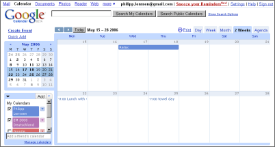
Google Calendar.
After Gmail’s launch, what did you work on? Google didn’t have that many products at the time. There was Blogger, Google Groups based on Deja, some search types... but there was no Google Docs, no Google Reader, no Google Sites, no Page Creator, and so on, right?
After Gmail’s launch I was still working on Gmail! So much Gmail development was still going on when it was in early beta (and continues to this day, of course). I did start working on some other small projects including one that eventually evolved into iGoogle. My first major project after Gmail was Google Calendar.
Google Calendar started as a 20% project of mine and another Google engineer. We both had some very definite ideas of how calendaring could be made better and that the well-established products had the same deficiencies. The project quickly gained momentum and resources and wasn’t a 20% project for very long.
While I’m on the subject, I’d like to mention that design is really a collaborative process and even when there’s a single UI designer or experience designer on the project, a big part of their job is synthesizing the ideas and desires of the rest of the team.
In Calendar’s case, while I was the lead UI designer for most of the development, by the time the product was really coalescing my time was getting split more and more with other projects and the Calendar experience was brought home by Doug Bowman, an extremely talented visual designer who Google had originally contracted with to do some visual design work for Calendar and othe products (prior to Calendar he’d done some fantastic work designing themes for Blogger).
At that time, what kind of problems did you see in typical other calendar apps on the market?
The biggest problem was calendar isolation. Most people have some sort of work calendar and some personal calendar, but for security reasons it was extremely difficult to view data from both in the same place. Most people kept calendars on their desktop or laptop, and unless they wanted to keep their personal calendar on their work computer they were out of luck.
The other big idea was shared calendars. It should be trivial to share your calendar with a specific group of other people, and to create events that existed across several peoples calendars. Outlook, Oracle Calendar, iCal and Yahoo Calendar each did some of these things, but usually not in a very elegant fashion. Calendars should be as easy as email, and should be accessible form anywhere, without concern for syncing or publishing.
When you design something like a calendar how do you find the right balance between improving through new inventions, and giving people what they are used to for the sake of easier understanding, say from their Outlook calendar?
That was actually more of a design consideration in Gmail. Virtually everyone who was signing up for Gmail already had experience with another email client, so there’s a balancing act between designing out of thin air and designing out of respect for the design patterns that people already use and understand. One of the more successful things about Gmail was that if you knew how to use another email program you could use Gmail instantly without too much learning.
That said, this was less of an issue with Calendar. There are some design patterns with calendars but the space wasn’t as evolved, and more importantly, a huge number of users had never used a digital calendar with any regularity, partly because they found them too cumbersome to be useful and partly because the lack of collaborative features I mentioned earlier made them less relevant. This meant that we were freer to design the best application we could rather than design to be like calendars which, by and large, were already broken in one way or another.
Folders vs Labels in Gmail
When you mention designing Gmail out of respect for existing design patterns... what do you say to the labels versus folders debate that has been going on for, I think, years?
Ironically, labels is a great example of when it’s best to not rely on existing design patterns, since in this case that would give the users a false understanding of the feature. Conversations were the most fundamental difference between Gmail and prior email applications. By treating messages in the same conversation as a single entity instead of separate emails, we gave users (especially users on mailing lists and those who get a lot of email) some real power.
The problem is that conversations meant we couldn’t have folders. The logic went like this: If you move a message from the Inbox into a folder and then another message came in on the same conversation, the conversation would pop back in to the Inbox (as it should). Should it still be in the folder as well? It’s very inefficient to move it back in to the folder each time, frustrated that it keeps popping out. And if it stays in the folder and the inbox, then how do you get it out of the inbox? If you throw it away it would throw away the conversation from everywhere, or maybe it should just throw it away from the Inbox and remain in the folder, in which case if you really wanted to delete something you’d either have to find it in all folders it was ever placed in, or you’d have to have some sort of ’super delete’ which, as it turned out, was a far more troublesome difference to grasp than that of multiple-inclusion folders (which is what labels are).
So instead of deleting from the inbox, or re-moving, you could ’archive’ the conversation (whether or not it was in another folder) and it would just take care of it.
Another way to look at the problem is if you have filters set up to put messages from certain people or with certain keywords in folders, the same conversation could appear in multiple folders because one message put it in ’family’ and another put it in ’vacation’. Then you have the same problem of a single item appearing within multiple containers that people have been trained to understand only hold originals or copies, not aliases, and you run into the same confusion with some users trying to delete out of a folder to keep a conversation in another folder, or expecting it to vanish from everywhere. Either way you’re going to have a huge number of users who either can’t delete or are accidentally deleting, which was a much bigger problem than calling them ’labels’ and teaching them about multiple-inclusion..
Do you know if other email clients had a conversations feature before Gmail?
Some email applications would let you group emails together by subject, but I’m not aware of any at the time that took the concept further than that.
After Gmail’s launch, what were some of the bigger public changes to the interface? And why were they made?
The biggest change was probably the incorporation of Google Talk, but the inclusion of the ’Delete’ button was also a big deal. :-)
From the beginning, Gmail was optimized for IM-like email conversations, so it was natural to extend that into a true in-browser IM experience that could integrate with third-party IM clients.
I noticed the chat-like Gmail conversations make it redundant to quote stuff on top, like people usually do with email clients. On the other hand, the other person may not use Gmail...
Very true. For most email clients it can be annoying to have to scroll through screens of quoted content before getting to the new stuff. Gmail would hide that content behind a ’show quoted text’ link so you’d know it was there, but not have to read it or be distracted by it, since it already appears in the earlier message cards in the conversation. For those people who don’t use Gmail, quoting on bottom is usually friendlier anyhow, though that’s a debate that predates Gmail (and may predate the Internet itself).
Google Reader, version 2
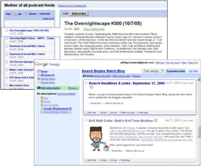
Google Reader’s original design from October 2005, and the redesign from September 2006.
You also worked on the interface overhaul of Google Reader, right?
Yep!
Why was it redesigned? The first version looked quite different.
This is a perfect example of why it’s vital to identify and design towards the multiple use models that represent your users.
The first version of Reader was awesome for those who prefer the ’river of news’ model, where you just have a long list of all the items from all your feeds, sorted by time.
The problem was that it didn’t work as well for users who liked to segment their reading by feed or by group/tag/folder, or those who had ’must read’ feeds and ’maybe if I get to it’ feeds. People use feed readers in a lot of very different ways. Their preferred habits are even more divergent than that of email users. We needed a design that adapted better to those different use models, while ideally feeling like it was specifically designed for the model you-the-user happen to prefer.
A few of us on the team still used Bloglines as our preferred reader, so one of the easy measures of success was to make a reader that we preferred to use ourselves. :-)
Are you then able to clearly track the success of a design through usage statistics or new sign-ups, or is this more fuzzy to track?
It’s really easy to track.
Do you use Google Reader a lot yourself today, or did you switch over to FriendFeed? I mean, FriendFeed is also a bit like an RSS reader...
I use both all the time. FriendFeed is great for sharing things, and for keeping track of what your friends are sharing online, but it isn’t optimized for reading high-volume feeds. I use Reader for reading feeds that have a lot of volume and no real community aspect. It wouldn’t make as much sense to read all of Boing Boing or Engadget in FriendFeed, though individual items from those sites might be shared into FriendFeed by someone you know.
When you looked into redesigning Reader, how important is it to make it feel similar to Gmail and other existing tools of the Google suite? For those users who want to use several Google tools.
Well there are definitely a lot of similarities with the ’mail reading’ model and the ’feed reading’ model, so it made sense to leverage the design aspects that applied to both, but at the same time it’s important to make sure that we didn’t copy design just for consistency’s sake. Making them too similar could actually be a drawback when the design implies similarities that just aren’t applicable.
Did Google ever consider putting a feed reader right into Gmail, more than the Web Clips feature?
Google strategy is one of those things I couldn’t comment on.
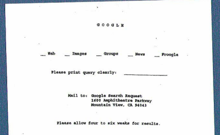
A parody by Kevin depicting “Google circa 1960."
Other projects at Google, and quitting Google
You also had your hands in the design of several other Google sites, right? Were you also involved in one of the latest Google homepage redesigns, which put the navigation from the top of the search box to the top right of the page?
I was heavily involved early on, but moved off the project well before launch.
I would think a change on the homepage involves a huge number of meetings and people and debates?
I suppose it’s fair to say that the amount of pragmatism and debate is roughly proportional to the number of users affected by the change, and that UI affects almost everyone.
Kevin in a photo shoot with a Guitar Hero game guitar (photo by Rachel Fisher).
How did your work at Google change over the four and a half years? I suppose it’s unavoidable there’s a lot more management type of work the larger your team and the company gets?
I think as any company grows it has to evolve. The same work models and chains of command don’t scale well when you grow an order of magnitude or two larger. Roles and responsibilities become better-defined and processes become more standardized when they need to be consistent across a company that’s grown large enough that people on one side can’t see people on the other side, metaphorically speaking.
Why did you quit Google? You announced your last day at Google at your blog in January...
I’d say it wasn’t so much ’quitting Google’ as ’joining FriendFeed’.
Everyone has a work-style that they prefer and perform best in, and going back to my earlier comment about more structured processes and roles, that’s really preferable for a lot of people. It fees them to focus on their core competencies and not have to worry about the rest.
Personally though, I missed the more free-form roles and ability to have a stronger influence on strategic direction while still working on the core user experience and design. FriendFeed was a great opportunity to get back to that kind of environment. It’s certainly not for everyone, but it was the right choice for me.
Issues in usability
I wanted to talk a bit about general usability issues. One thing I find interesting is usability expert Joel Spolsky’s statement, “Users don’t read anything.” What do you think about this?
It’s not supposed to be taken literally, of course, but it’s a good generalization.
Users will generally read as little as they think they can get away with to accomplish a task, so it’s a good idea to design such that the most visually obvious path is the right one, and if there’s not one extremely obvious path or if the user really needs to make a considered decision, that the words be as close to the decision widget as possible, and as brief as possible and still be clear.
A classic example is if the user performs an operation that requires a secondary question. For example “Do you want to also do [other thing]?” with buttons for each option. The wrong way to go would be a big dialog box with a paragraph explaining the option, followed by the sentence “Do you want to do this?” followed by two buttons that say [Yes] and [No]. Users will read the shortest text first (Yes or no) which is useless and then, if they don’t just choose the bold or default button, assuming it’s the right one, they’ll look for the question “Do you want to do this?” which is similarly unhelpful, and may even be misleading, since they’ll think “Of course I want to do it! It’s what I just asked the system to do!”.
Finally the rare user who really wants to be sure will read the full text and try and understand it, but most users will have just made an uninformed choice, just to not have to read.
A better way to design such a dialog (if you can’t design a way to make the secondary dialog unnecessary in the first place) is to label the buttons [Yes, also do (secondary thing)] and [No, just do (primary thing)] so the user who already understands what (secondary thing) is doesn’t have to read any further, and the user who doesn’t care to know what (secondary thing) is can click ’No’ without worrying whether their primary task will be accomplished. The explanatory text is still available in the dialog box (though perhaps shortened to a briefer description and a ’Learn more’ link) but the user doesn’t have to read it to make a relatively informed decision.
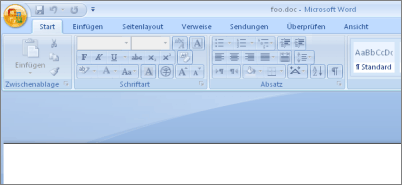
The Microsoft Office ribbons toolbar.
You use a Mac these days, but do you also follow what kind of designs Microsoft releases, like Windows and Office?
To some degree. I don’t go and install Vista to see how they’ve changed design patterns X, Y, and Z, but I certainly took a good look at the ribbons in Office because they’re a great example of refactoring a huge amount of features into a more manageable design.
If I designed client software for Windows I’d keep much closer tabs on how their design patterns are evolving.
So I take it you think they’re better usability than old-fashioned menus?
They’re better usability than the mass of toolbars that afflicted earlier versions of Office.
Side projects
“It was an exciting time for blogging, when bloggers were still trying to decide what blogging meant, and non-bloggers didn’t understand why people would expose so much of their lives to the general public.”
You have a couple of private projects going. Like your blog [Fury.com], which is online since 1998. That must make it one of the very early blogs?
It was. It was an exciting time for blogging, when bloggers were still trying to decide what blogging meant, and non-bloggers didn’t understand why people would expose so much of their lives to the general public.
How did you blog, what software were you using?
My earliest blog was just an HTML file. I’d just edit it when I had a new entry.
After that I wrote my own blog software using PHP and MySQL. At the time it was great because I could add features like comments and multiple-inclusion categories before they were offered by the blog software of the day (e.g. Blogger, Greymatter).
I still use my own software (my blogging has gotten much more sporadic though, as I share more in different conduits like FriendFeed, and Twitter) but it’s more of a pride thing now. I don’t want to take the effort to switch everything over to a third-party blog service, and I find tools like Movable Type to be finicky. If I’m going to hit a stumbling block, I’d rather it’s one completely of my own making.
How many bloggers were around in 1998, do you have any idea? Was it a small closely connected community?
Oh it’s really hard to say how many there were because there were many communities that weren’t necessarily closely connected with each other. The community I was most involved in was a sort of ’B-lister’ crowd. Not Kottke or Megnut or Ev, but people like Ernie, Min-Jung Kim, and Metagrrl. The 2001 SXSW [South by Southwest conference] Geek blogging crowd.
OK. Did you get any acquisition offers for your domain fury.com in the meantime? It’s a pretty short one...
All the time. It’s pretty important to me though. Ironically, I almost started out as joy.com instead.This was back in 1996. joy.com was available but back in those days you got a domain by filling out a form with your ISP and they’d file it with Network Solutions and they’d take 4 weeks to process it. It turned out that somewhere ahead of me in that 4-week line was someone requesting joy.com, so when I found out I looked for another short, simple name. I turned to ’fury’ out of my frustration of being denied ’joy’.
What other side projects do you have? Can you tell us a bit about [RandomPixel, formerly known as Cameo] and News in Haiku?
Randompixel is a project where I’d buy disposable cameras and cover them in stickers instructing people to take a picture and pass the camera on to someone else, a stranger or friend. It had postage and an address on it so when someone took the last picture they’d drop it in the mail, I’d develop the photos and post them on the site. Of the first batch of 10 cameras, 3 came back, though one of them took 2 years.
News in Haiku was a project that my fiancee and I took on a little over a year ago, picking a prominent news story each day and re-telling it in Haiku form. Like all my projects, there are always plans for how to make it better, more engaging, more community-oriented, but time is always the scarcest commodity.
Four words on...
Could you give a four word comment on... Paul Buchheit?
“Email isn’t solved yet”
... FriendFeed?
Friends make Internet interesting.
... Marissa Mayer?
“Let’s cut one word”
... biggest usability pitfall?
Designing features in isolation.
... the Google homepage?
Utility, not Entertainment Weekly.
... future of the internet?
Less content, more often.
>> More posts
Advertisement
This site unofficially covers Google™ and more with some rights reserved. Join our forum!