Tuesday, June 17, 2008
Redesigning the Google Favicon
The designers at TurboMilk didn’t like the new Google favicon – the icon displayed in the address bar and elsewhere on Google’s sites – so they decided to take the design job in their own hands. Four designers each had a try at a redesign, and came up with different reasoning and different end results. Here’s one of their results:

As the official Google blog told a while ago, Google’s new favicon too was the result of different explorations of the Google design team, as Google’s image shows....
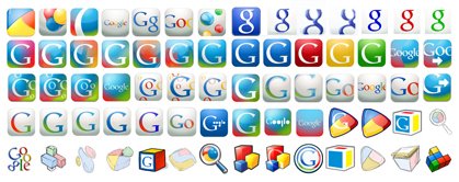
(I actually didn’t think Google’s new favicon was all that bad. It’s more humble and open than the old one, it’s a little underdesigned – merely reusing something that looks similar to the lower-case Google “g”, instead of introducing yet another “iconic image” – while still not being too playful, as Google is delving into a more serious “office suite” territory with Google Docs. It also doesn’t repeat all the colorfulness of the main Google logo in yet another place, the address bar, which might be good as it does not draw too much attention to the favicon. On the other hand, some of you complained how it was harder now to quickly find the Google tab when using multiple browser tabs... and perhaps that’s a case where more colors and more “attention” to the icon would make sense.)
[Thanks Denis!]
>> More posts
Advertisement
This site unofficially covers Google™ and more with some rights reserved. Join our forum!