Tuesday, March 17, 2009
In Interfaces, Similar Things Should Have Similar Names (and Vice Versa)
A good interface usability rule-of-thumb is: when two things do the same, name them the same... but when two things do something different, name them differently. This streamlines your site and makes actions more expectable, and expectability enhances usability. To give you an example of a particular offender of the second part of the rule – when two things do something different, name them differently – take Reddit’s comment edit functionality.
Here’s what the interface looks like before you edit your comment:

It’s pretty obvious you need to click “edit” when you want to edit your comment. And sure enough, you’ll learn to associate the word “edit” with “start editing a comment” at Reddit. Now when you do click edit, an interface like the following expands:
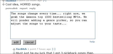
When you’re done editing, what do you click? The button is named “edit”, but this is not the most intuitive name – because you learned to associate “edit” with “start editing a comment.” Of course, it may only take a very small, perhaps second-long delay and you’ll understand what you need to do (you need to click the “edit” button again). But you’ve just been made to think, and that’s something interfaces should avoid doing to us. The “thinking” part should be reserved for a site’s content (and only when the interface is intended to challenge you, like for artistic reasons, does it become part of the content).
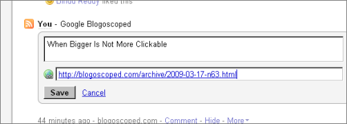
To see how that interface should have been done, take a look at Friendfeed. There, entering the edit mode is called More -> “Edit this entry”, but the button to save the comment is called by what it does, “Save” (and it is weighted more strongly than the canceling action):
>> More posts
Advertisement
This site unofficially covers Google™ and more with some rights reserved. Join our forum!