Thursday, May 6, 2010
Google’s New Look
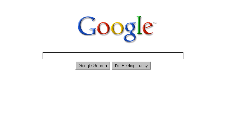
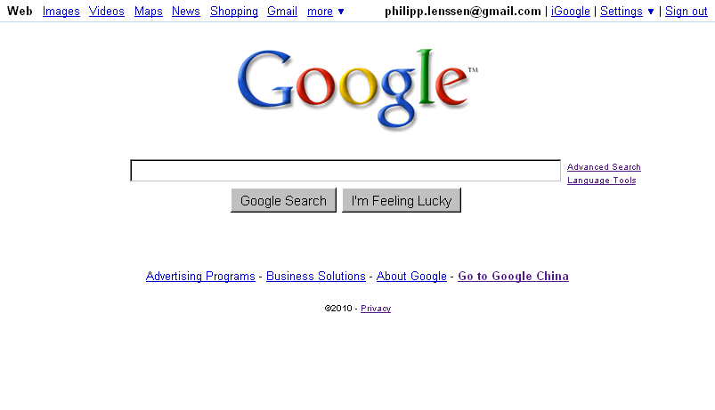
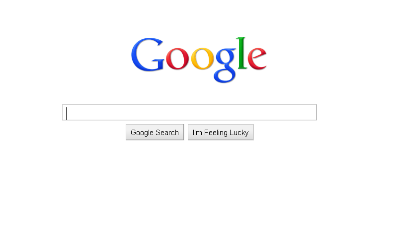
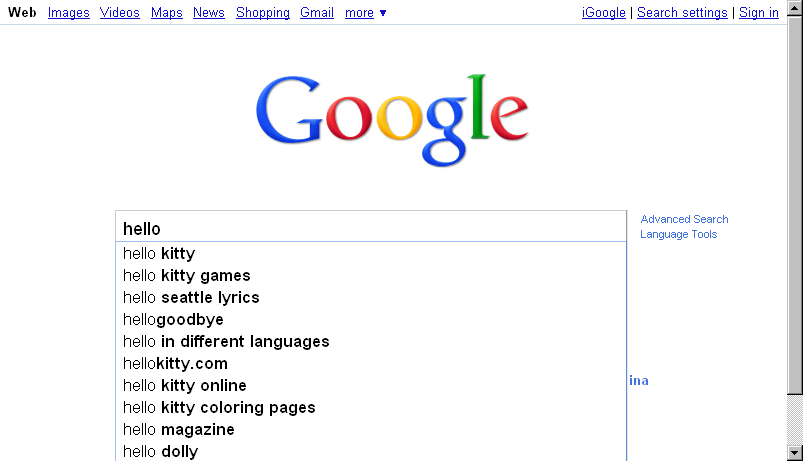
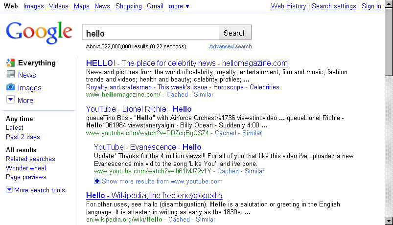
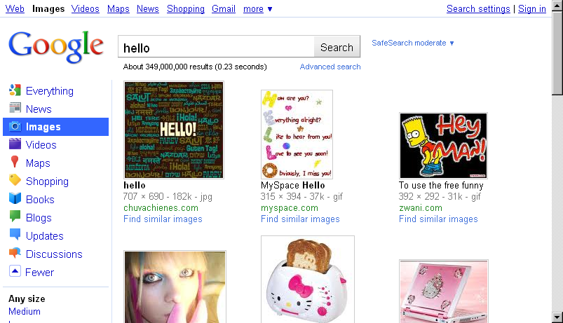
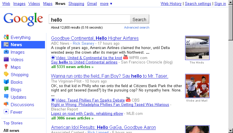
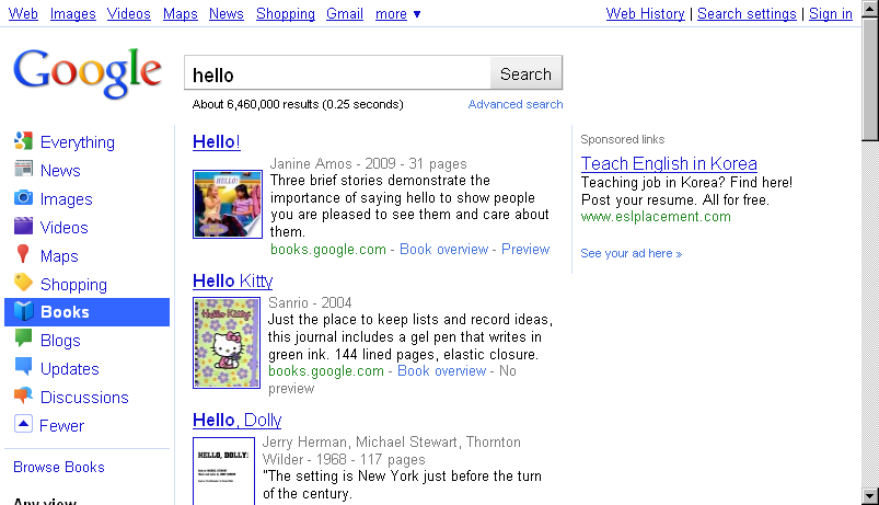
Google has been testing this redesign for a long time, and today it’s going live globally. You will see a new logo and a new left-hand side bar in results. The logo feels brighter and flatter than the old one, the search results have become less minimalist.
I’ll wait to see if I grow used to the side bar, I get a feeling that for the most part I will simply ignore it as I don’t need it (I rarely do a web search and then want to switch to book search, or videos; often when I want a maps or image search, I go straight to that particular search). But who knows, perhaps it’s useful for certain types of research tasks, and it does make the different Google sites discoverable for users who might not know them (though with Google’s “jazzy” onebox model, which is still in for the “everything” search, discoverability of the other sites was also provided). The UI of Google’s sub services also feels more consolidated now, part of a single search. In the meantime the crown for most uncluttered search results might have to be passed on to another site in 2010.
What do you like about the new design, and what do you dislike?

[Thanks WebSonic.nl and everyone who mailed this in!]
>> More posts
Advertisement
This site unofficially covers Google™ and more with some rights reserved. Join our forum!