Wednesday, July 21, 2010
New Google Images Design
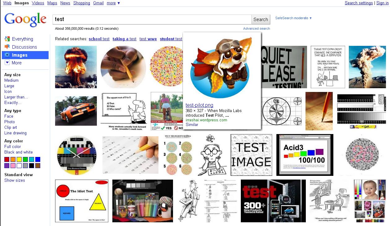
Google has revamped its image search. Instead of showing image information right below individual images in the results overview, you’ll now get just the image thumbnail. Hover over it, and the thumbnail will grow a bit in size and show its information text below it, like file name, originating site, and contextual keywords (you can also click on “Similar" for some pics to find similar imagery). Thumbs are presented border-less, and rather close to each other.
When you scroll down the results page, new images will be dynamically loaded into the page without a manual page switch (you’ll still see headers reading “Page 2”, “Page 3” and so on, perhaps to give a bit of direction). Looks like Google is getting more Bing-like here. In a blog post, they also mention their new thumbnails are larger than before.
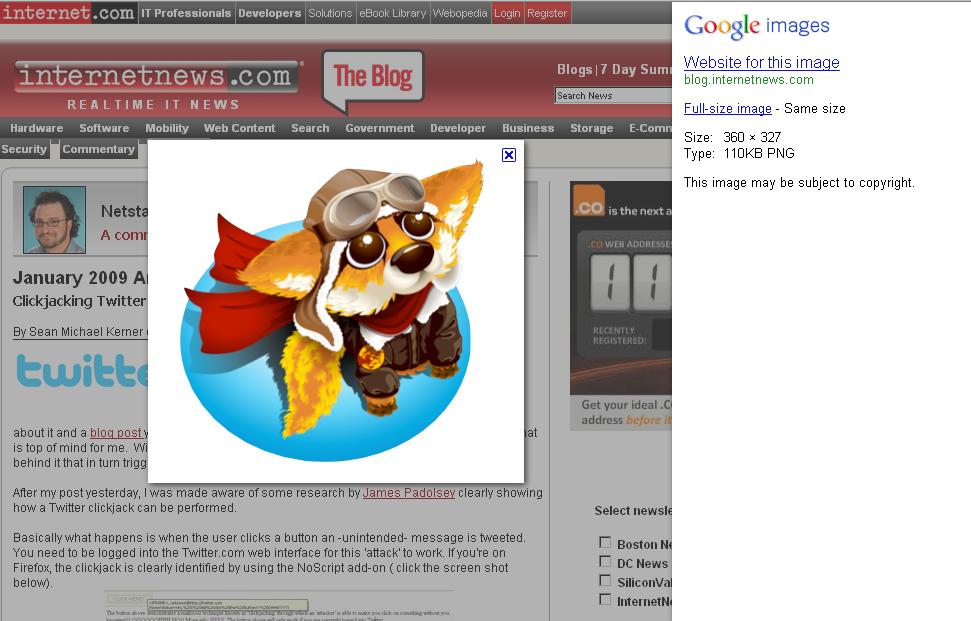
Clicking through to an individual page shows an interesting new layout as well. Many of us sometimes just want to get to the individual image, and only later (sometimes not at all) look at the context page. What Google previously did in the US – in countries like China this differed already – was to show a two-frame page, and if you clicked in the image in Google’s top frame, you’d see the big version without context, saving you from scrolling down on the origin page to look for the image.
Now what Google does is show their own side pane to the right, then dynamically overlay a big version of the image onto the slightly darkened web page it originates at. (Sometimes, an even bigger version is linked to from Google’s side pane.) An X button in the upper right of the bigger picture closes both the pic, as well as Google’s side pane. All in all, I think this is a nice solution that creates a very usable mixture of getting the origin page to show its face, but also letting the user see the big image immediately... and Google’s side pane can be closed easily, too. Admittedly, the origin page may now be getting less visitors to look at it closely than before, hard to tell.
[Update: In case you don’t like the new Google Images version – when you scroll way down to the end of the page, there is a link named “Switch to basic version”, which brings back the old design.]
Added to above changes, Google in their post says that for their advertisers, they’re “launching a new ad format called Image Search Ads. These ads appear only on Google Images, and they let you include a thumbnail image alongside your lines of text.”
For what it’s worth, the thumbnails in the results of the the old image search were often blocked here in China (often only a small portion of the pics would show). The thumbs in the new version all show up fine for now, though I’m not sure if this is perhaps a recent change in no relation and so just the usual mysterious blocking flicker.
[Thanks Juha-Matti and Morgan!]
>> More posts
Advertisement
This site unofficially covers Google™ and more with some rights reserved. Join our forum!