Friday, May 11, 2007
Google Layouts Timeline
By Colin Colehour
Google has been testing new layouts for the past couple of years. Each layout seems to build upon what Google has tried in the past. This timeline reflects just some of the layouts seen from 2005 through today.
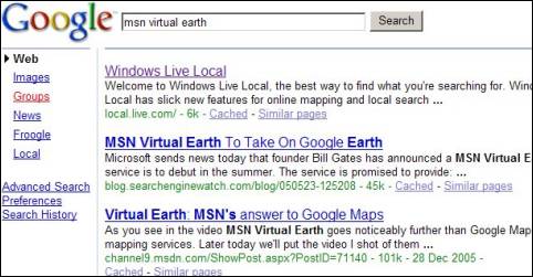
December 2005
The first test layout showing the different search option links displayed on the left hand side of the screen rather than their original horizontal location above the search box.
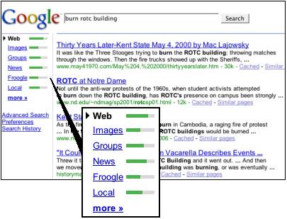
March 2006
The second layout, spotted in the wild, has the left hand side search option links like we’ve seen before but now they have green bars next to them. It was unknown what the green bars truly represented.
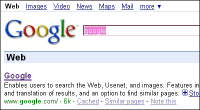
March 2007
The search option links have now been moved to the top left hand corner of the screen. Nothing else has changed in the layout of the page though.
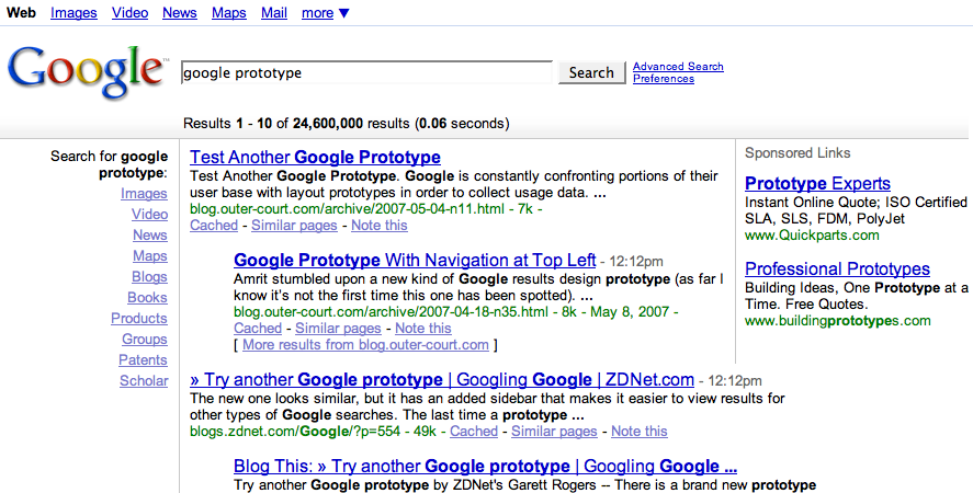
April 2007
This new layout has related searches at the top of the search results as well as links to other search options that your query can be performed in. For example, doing a search for C++ will generate links to Code Search, Books, & Groups. The search option links only display if your query has results for that search type. The usual search option links ’Web, Images, Video, etc are still visible in the top left hand side of the screen.
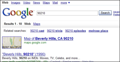
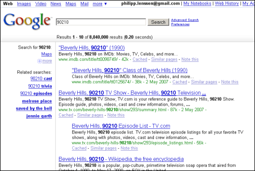
May 2007
This layout has the same top left search option links that we’ve seen in the past. It also displays related searches on the left hand side of the search results. If your query does not have related searches, you might also see a list of different search options that you can perform with the same query string. The list of search options now includes more options like Blogs, Books, Products, Groups, Patents & Scholar.
Two more layouts have been seen recently. Both layouts have the standard search option links above the search box. Also, both layouts have the gradient bar above the search results. Neither of these new layouts has related searches though.


There are several things that Google seems to be focusing on with these latest tests: Placement of the different search option links like Images, News, Video, etc., placement of related search links, and finding new ways to get users to try their queries in other search verticals (Books, Products, Scholar, etc).
Given all the layouts you’ve seen Google test over the years, which do you prefer and why? Do you have any suggestions for improvements you’d like to see Google make to their results pages?
[Update: Disclosure – Colin worked as a contractor for the Google Partner Solutions organization for 1 year; at the time of him writing this post he already did not work there, and we also originally disclosed this relation in Colin’s first blog post. Just figured it is worth it to repeat it in his posts. -Philipp]
>> More posts
Advertisement
This site unofficially covers Google™ and more with some rights reserved. Join our forum!