Wednesday, September 19, 2007
Live.com Usability Case Study
Walking barefoot over a cobblestone path is possible, and no step in particular will injure your feet. But the overall experience isn’t nice. It’s the same when a website has minor usability problems piling up: none of the issues taken on its own is disastrous at all, but taken together, the site ends up being a slightly bad experience. I wanted to take a minute to illustrate such a collection of minor usability issues with the new Live.com, Microsoft’s search effort. All in all shows that the Live.com team doesn’t have people with a 100% focus on usability.
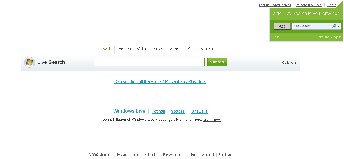
Let’s start with the frontpage as it presents itself. Nice design, looks like a search engine, not too cluttered. Good. (Not original, but good usability is not about being original... often the opposite is true.)

Cobblestone 1. Low contrast. The contrasts for a selected tab vs an unselected tab are too low. Clearer colors, using underline, bold etc. could help.

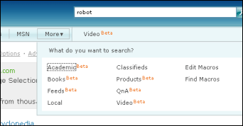
Cobblestone 2. Real interface vs screenshots confusion. Can you guess which elements in above part of the page can be used, and which are mere screenshots? Answer: everything is “real” except for the search box. It makes sense when you know what this is supposed to be – an illustration of a browser search box – but it’s not intuitive. Screenshots of interfaces fit much better in e.g. a blog article like this one, and even then one needs to take care to make a screenshot look more “screenshot"-like (e.g. via blur shadows, cropping, resampling, borders and so on).

Cobblestone 3. Text clutter. It’s important to not clutter the screen with information that is not important at this part of the user interaction stage. If the information isn’t critical or has mere informative nature, like this abundance of orange “Beta” signs which draw most of the attention in this drop-down, then the information shouldn’t be included at that point. (The situation would be different if most of the menu items would be of “normal” status, and only one was in Beta – then, the orange “Beta” would carry more relevant information, and perhaps deserve extra attention.)

Almost-Cobblestone 4. Removing the 3D border of input elements. This one is actually mostly OK as the Live.com design uses a darker background color behind the search box, and at least the border has a bevel design (usually, input elements use an inset 3D border, and buttons use an outset 3D border). But in my experience it starts causing misunderstandings if you remove the inset border and use the same color as the background, even more so when the button next to the input element has a flat border too. The highest user understanding is only achieved with an actual 3D border, even though these tend to look old-fashioned (e.g. I’m using a 1-pixel border on this site).
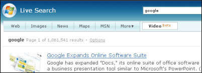
Cobblestone 5. Inconsistent tab order. From the homepage, I selected the “Video” tab and searched for google. The video tab was in third position on the homepage, but now it moved to the right of the “more” dropdown into 7th position. Not only doesn’t this make much sense and is confusing due to a lack of consistency, this approach is also inconsistent in that it’s not repeated when you e.g. choose the “Image” tab (as that tab will not move to the 7th position). The user model doesn’t match the programmer’s software model: the “rule” here seems to be that Video is in Beta and thus somehow must move to the right on search results (and results only), but this rule is too arbitrary to be intuitive. Programmers & designers should always try to match the user model, that “mental understanding of what the program is doing for them,” as Spolsky says.
Cobblestone 6. Hiding crucial information by default. On image search results pages, you need to hover over an image to see information like the domain the image is from. In general, hiding non-relevant information is a good approach as it unclutters the design, but if the information is too crucial, then making the user to hover first starts to become a barrier.
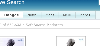
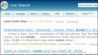
Cobblestone 7. Non-underlined links. Underlined links are still more recognizable as such, even in this day and age. Above screenshot of the upper part of an image search result does not make it 100% obvious how to change the SafeSearch setting. In this case, perhaps that’s done on purpose as “child safety,” and for sure adults will be able to figure it out. It’s still a good reminder that links you want people to easily find need to be underlined.
Cobblestone 8. Inconsistent “more” dropdown. The “more” dialog on the homepage doesn’t match the “more” dialog on results pages. Neither in its design – from vertical to multi-rows etc. – nor in its behavior. E.g. dialog 1 expands without animation and remains open when you move the mouse away, while dialog 2 expand with an animation and collapses when you move the mouse away. In a good interface, sufficiently similar things look & behave similar, and sufficiently different things look & behave differently.
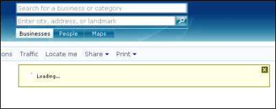
Cobblestone 9. Unclear purpose of interface elements. When you do a Maps search, there will be a temporary loading window before the map appears. This window has an “X” button to close it, though its exact purpose is hard to understand. Try to guess: Will it cancel the search... speed up the loading... or minimize the “loading” window? (Spoiler: I think it just minimizes the “loading” window.) It sure sounds nice on the surface to empower the user to do something with the “loading” window, but as Spolsky says, sometimes choices equal headaches.
Cobblestone 10. Pimping your own products to the detriment of the user. Originally I expected the “MSN” tab in Live.com to take me to the MSN homepage at MSN.com, or perhaps do something in relation to MSN messenger (called Windows Live Messenger these days, but you never know). What it actually does is search for your query across msn.com properties, like MSNBC.msn.com or groups.msn.com. It’s easy to imagine why Microsoft wants people to search through these properties specifically, but why would an average search user want that on a regular basis (it’s a main tab after all)?
>> More posts
Advertisement
This site unofficially covers Google™ and more with some rights reserved. Join our forum!