Thursday, November 29, 2007
Abstract vs Realistic Icons
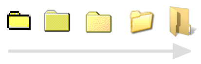
As the Windows operating system progressed, so did its icons, like the folder icon displayed above from Win 3.x to Vista. Or rather, they’ve become more pretty and realistic over time. But is realism more effective? I don’t think so. Street signs are a good example of pictograms where quick recognition is crucial, and there’s a reason they did not evolve towards more realism.
(Some of the operating system icons additionally have to have flexibility to efficiently cope with different modes: a folder can be open or closed, full or empty, write-protected or not and so on.)


A street sign, and the Chinese sign for “hill.”
Also, the more abstract an icon, the more it can represent a group of things vs one specific thing. And if you use specific pictograms long enough, they turn to written language itself. Chinese characters too, for instance, evolved out of pictures – but they evolved in the direction of becoming more abstract, not more realistic, as this allows fast recognition and thus reading. (Not necessarily easy learning, though.)
However, people don’t just buy the most usable operating system. The decision to buy something can be dependent on factors vastly different from everyday usability – because to measure everyday usability, you already need to have acquired the program. The decision to do so, however, must be made before actual usage, and can be influenced by such things as “how beautiful does it look?” Even when you read a review to make a more educated choice before buying, the reviewer may not have used the program for that long.
There was an interesting episode in Malcom Gladwell’s book Blink. People who made the Pepsi vs Coke test on the street by sipping a bit from either drink – without knowing which brand they were tasting – significantly preferred Pepsi. Pepsi was able to utilize this fact in an advertising campaign. However, when people were made to take a few bottles of a drink of either brand home for a while, in order to give it a longer test run, they would later more often prefer the taste of Coke. The reason for this, according to Malcom Gladwell? Pepsi is sweeter, so people prefer its taste for short sips (like during a street test) – but they would prefer less sugar when drinking something on a more regular basis.
Windows icons – and Mac icons, for that matter – have definitely become sweeter over time.
Can icons be made “prettier” without sacrificing recognition then? Yes, I think there are some ways. (Perhaps designers of some of the modern operating systems even tried these ways, though I don’t think they were successful at all times.) The basic pictogram layout would need to be designed first. It must be robust enough to be sufficiently different to other icons. It would be able to “survive” it being blurred, or reduced to shades of gray, or resized to a tiny resolution. You would need to be able to recognize it even by just looking at its silhouette. You would be able to recognize it even when it’s shown only part of a second.
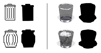
Applying the silhouette test to an old vs a new “dual-state” Mac trash icon.
Now, once the base design is stable, very soft decorative shades could be added to the icon. Edges can be anti-aliased. With each iterative decorative step, the effect of the decoration must be so subtle as to not take away from the base design. The icon would still be further away from abstract language (including “operating system grammar”) now, but it might be a compromise between allowing the program to be easily marketable while still being highly usable.
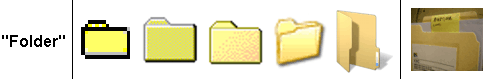
From language to reality, and from “any folder” (including yours) to “a folder” (excluding yours).
[Bottom right folder photo CC-licensed by XXC.]
>> More posts
Advertisement
This site unofficially covers Google™ and more with some rights reserved. Join our forum!