Monday, August 25, 2008
Pitfalls to Avoid When Designing Forms
Many web forms are broken, usability-wise. Knowing these problems can make you avoid them when you design your own web forms, so here are some recurring usability pitfalls.
1. The risky reset button. In most instances, the form reset button is not needed, though it can almost always do harm if users accidentally click it – because it will empty the form without any confirmation box (in popular browsers and popular form implementations, anyway). Take a look at this brilliantly bad-designed German form; it’s meant to calculate the subway route from one place to another:
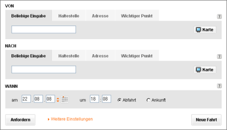
The quick solution: don’t use a reset button. (And if you do decide you need one after careful consideration, use it with great care.)
2. Choices are good, right? Not really, at least not when it comes to web forms. Only offer the choices absolutely necessary in the context of what the user is trying to achieve – everything else can clutter the screen, add confusion, and actually make the user miss out on taking time to reflect on those choices which are needed and which are important. Isn’t it ironic that most forms on the web which are doing something infinitely simpler than, say, a Google search across billions of documents, are still infinitely more complicated to use than Google’s form?
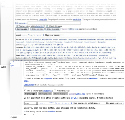
If you absolutely do need a lot of choice, consider hiding the more rarely used choices within an expandable advanced dialog. Consider how Wikipedia changed their syntax quick picker dialog (while editing a page, you can click on the links below the editing form to have that bit inserted into the page) from showing all and too much, to showing just a little, sorted by topic via a select box.
3. Forms are still part of the web page, and the web. As such, they should adhere to basic web usability rules like making fonts big enough to be readable, and making links look like links and making non-links not look like links. The common way to make a link look clickable is to use an underline, or using blue. But take this Hotmail sign in form – can you guess what’s a link and what’s not just by looking at it?
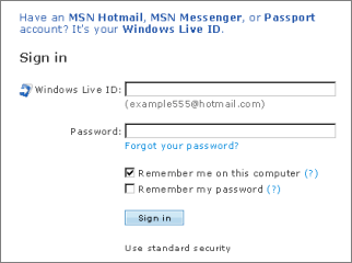
It turns out the top text (“Have an MSN Hotmail...”), which is blue and thus looks linked is just an info message which doesn’t lead anywhere else. The bottom text (“Use enhanced security”) on the other hand is a link, even when there’s no visual clue provided to get the point across.
Another recurring problems is that form success and failure are not using distinctive color schemes. Do not print a success message in red, for instance... no matter what words you type for that message – say, “Your form submission was a success, congratulations!” – the red color can cause a second of confusion. Similarly, symbols that can be interpreted as warnings should be avoided on mere informational messages.
4. You do the math. Don’t require operations to be performed by the user if you can do it automatically with your script. Take the time zone converter below, a useful tool that can make you arrange a schedule when your friend lives across the ocean.
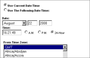
This service offers two basic options: convert from the current date, or convert from another, defined date. However, when you define your own date & time in the boxes displayed in the middle, this value will be ignored when you hit submit... unless you also checked the “Use the following Date/ Time” checkbox. The obvious thing to do here would be to automatically check the “Use the following...” box as soon as the user enters a custom date (why else would they enter it if they don’t want the form to handle it?).
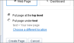
5. Do not require the user to precisely hit a radio button. Instead, make the text next to the radio button itself clickable. This was common interface tradition on Windows once though it’s ignored by many web forms... even when HTML provides a really easy way to do it (it doesn’t even require JavaScript). The form below, taken from Google Sites, is an offender of this rule as well, as clicking on the “Put page under...” label doesn’t mark the box next to it checked:
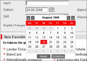
6. Don’t force the user towards your custom date picker or other widget. Date pickers in the form of an expanding calendar widget can be a nice thing, but sometimes a user may just wish to enter the date on their own, as plain text (say, by typing “2008-12-24”). If you do decide you need a calendar picker widget, then don’t force the user to use it by e.g. popping it up over the input box as soon as that box is focused. The official German train route calculator form is an example of this – as soon as you select the input box it pops up a calendar widget, but even when you manually entered something and then clicked another input box in that form, it won’t close itself (so you always need to hit its close button).
To see a more usable example, take a look at the event editor part of Google Calendar. When you edit the event date or time, the widget will pop up but in general doesn’t get in your way if you don’t want to use it, letting you enter free-style text instead.
7. Your Ajax change may be too subtle. Sure, Ajax is the greatest web thing since the title tag, but that doesn’t mean it can’t be abused... because it can, in plenty of ways. One such way is to provide form feedback – say, “you’re now logged in” or “there is an error with your form input” – in the form of a subtle Ajax update to the page somewhere which the user can easily miss. In such circumstances, repeated clicking of the Submit button won’t help, and the task results in confusion. Too-subtle layouts for important messages are always bad but at least when there was a page switch and the accompanying visible loading time, users were more carefully looking for that message.
If you give Ajax feedback to form problems or successes, make them very highly visible. Consider that the user might even have switched to another browser window after hitting submit, figuring that it may take some seconds for the submission to get through; upon returing to your site’s window, will that user get your message... or believe the form submission got stuck?
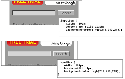
8. 3D effects in input boxes can look oldfashioned and sometimes ugly, but don’t remove them or all 3D color cues unless you’re aware it might add confusion. If you’re using a default input box, it will render with a slight 3D inset border in popular browsers. If you render a white box on a white background, try not to remove the 3D effect completely, as it makes the input location look less like, well, a place to input text. The same goes for 3D outset borders used on buttons, which look much less clickable without borders. However, I believe you can try to get away removing much of the 3D effect if you use clear color cues and the form is rather short – like a darker form background with a white input box on a single search box. I’m somewhat undecided on this though, but you can judge for yourself:
9. If the data seems OK, then give it a go and don’t ask for another confirmation, and don’t ask for the data to be provided in the very precise form your database needs it. Some web forms convert data like a free style address input by the user to their own “correct” database format... and then offer it as part of a combo box for you to confirm again. If however the form realizes that with good certainty that combo box selection was indeed what the user was after, no such confirmation should be necessary to see the results – instead, there could be a less obtrusive option somewhere below or above the result page which lets the user optionally select other, perhaps better values.
Even other forms force the exact database syntax on the user. If however e.g. your credit card number checker doesn’t accept blanks, then just handle this fuzzy and remove them, and don’t require the user to remove the blanks on their own.
10. Yes, selling detailed user data can get you rich quick (or so I heard). But that doesn’t mean collecting an abundance of information is the right thing to do for your web service. If all you offer is, say, an email service, then how important really is the gender of the user, or their home phone number and so on? The best web forms try to restrict the data to just those things absolutely needed for the service to work (plus, where necessary, fields required legally, or for security reasons... like those awful captchas, which are a big usability problems with forms today).
There are many other usability guidelines which help as well. Like keeping your text short, which is always good for interfaces. Also, use positives in text when asking for the user to make a choice; it’s more intuitive to understand a checkbox reading “do this” or “show this” than one reading “don’t do this” or “hide this” (not to mention quasi double negations like “don’t hide” and so on). And once the form is submitted, it’s important to actually send the user to the most appropriate follow-up location for the task at hand (if the task is not finished yet), and not just to a general “thank you” page. And whatever you do, you need to realize that your users spend most of their time on other web forms, so sometimes the optimal solution might just be to copy what people are used to and already understand – and you need to consider that people may have multiple windows open and just treat your form as a side-task, perhaps giving up on it if they find it doesn’t do what they were expecting.
In the end, most things that make a good form good are common sense, so it just takes time to reflect on your form and look at it from an outsider perspective... by trying to imagine what it looks like to someone who doesn’t know (or care) about your database structure, your many considerations, or the history of your product. To the user, your form is likely not the task in itself, but a necessary obstacle to achieving that task. Better design it like a traffic sign (to be glanced at while driving by at 100 km/h) than like, say, a book (which you’ll open sitting in your armchair with lots of time on your hands).
[First Wikipedia screenshot by ITDL.org.]
>> More posts
Advertisement
This site unofficially covers Google™ and more with some rights reserved. Join our forum!