Thursday, December 3, 2009
Google’s Fade-In Homepage Now Official
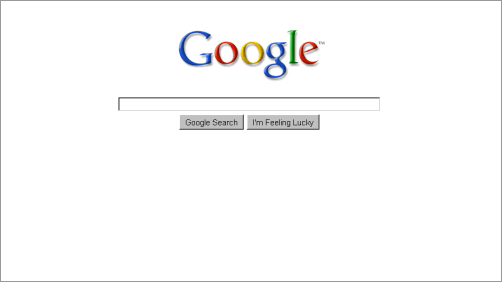
This might surprise you, but Google has made their “fade-in” homepage variant – or more precisely, one of the several prototypes they were testing – their official homepage design now, as they announce at their blog. This is a major redesign for Google.com: at first when you see the page, you’ll only be looking at the Google logo, the search box, and the search and feeling lucky buttons. Only after you’ve moved your mouse will other bits of the page appear, too, letting you jump over to apps like Gmail or Google Maps.
I can’t see this redesign at the moment but that might be due to the fact I’m sitting on an Internet Explorer 6 here in an internet cafe, and who knows, older browser might not be supported for the fade in dynamics. When Google launched the fade-in design as prototype I did join it though because I liked. Who’d have thought that minimal Google would be getting even more minimal over the years? In terms of web design laws of physics, especially as the company gets bigger, the natural gravity pull is always towards clutter... from what I saw, it takes extra efforts to go the opposite direction. I’ve seen company homepages turn into a blinking collage because every department of that company wanted to get their thing in, nevermind what statistical significance their use case had for the audience. For Google.com, I’d guess the overwhelmingly most significant use case remains to be search.
[Thanks James Xuan!]
>> More posts
Advertisement
This site unofficially covers Google™ and more with some rights reserved. Join our forum!

