Wednesday, June 27, 2007
New Google Docs Start Page
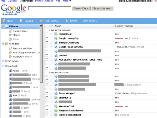
Google completely overhauled their Google Docs & Spreadsheets start page today. The file listing now resembles a more traditional view in the style of, say, Windows Explorer. To the left side you’ll find a navigation pane with folders – that’s right, not labels, which Google focused on in e.g. Gmail (though you’re allowed to put a file in multiple folders) – and to the right side, you’ll see your documents. Documents can be drag & dropped to a left-side folder. You can also restrict the view to see only those docs you created, only those which are starred, or only those which you shared with certain people (among other views).
And as of today, the search functionality on top of Google D&S has an auto-completion feature. For instance, when I enter “Google Press” it will offer me a document titled “Google Press Day 2007”... clicking on it will open a new window including that file.
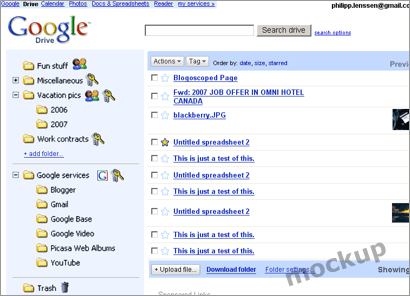
Google D&S looks more and more like an office application, or an operating system, if you will – it might only be a matter of time until Google renames this to a more meaningful term, too, like “Google Office,” “Google Files,” “Google Drive,” “Google Explorer” or similar. (In particular when Google releases a presentations applications this summer, as the name “Google Docs, Spreadsheets & Presentations” would sound too ridiculous.)

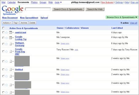
This is what the Google Docs homepage looked like before...

This last one is actually just a mockup I created a while ago.
[Thanks Jason F.!]
>> More posts
Advertisement
This site unofficially covers Google™ and more with some rights reserved. Join our forum!

