Friday, May 29, 2009
Google Increases White Space Around Logo on Result Pages

It looks like Google increased the margin above and below their logo on the SERPs. Anyone dares speculate why?
I asked ex-Google employee and Gmail (and more) designer Kevin Fox to guess about why Google did the change, and what effect it might have on the user. Kevin says, “Greater breathing room. If Google could improve their rankings to the point where the ’right’ answer was just as likely to be in the first N results as it used to be in the first N+1 results, they can pass the savings on to the user by showing them less clutter. If Google was confident that the right answer was always in the top 3, they’d probably just show 3 and have a lot more whitespace. :-) But that’s all just speculation.”
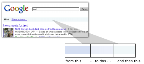
One of the last design changes to the Google results was making the blue bar on top lighter in color, around half a year ago. Even though that could be considered a subtle change, Google actually moved the blue color from old to new in not one but two steps, meaning there was an intermediate blue used for a while... perhaps to make the change less noticeable to users:
On a related note, also recently, Google announced a change to their logos.
[Thanks Johan!]
>> More posts
Advertisement
This site unofficially covers Google™ and more with some rights reserved. Join our forum!